HARLEY-DAVIDSON PROCESS
BEGIN
PROCESS
P.1
DISCOVERY
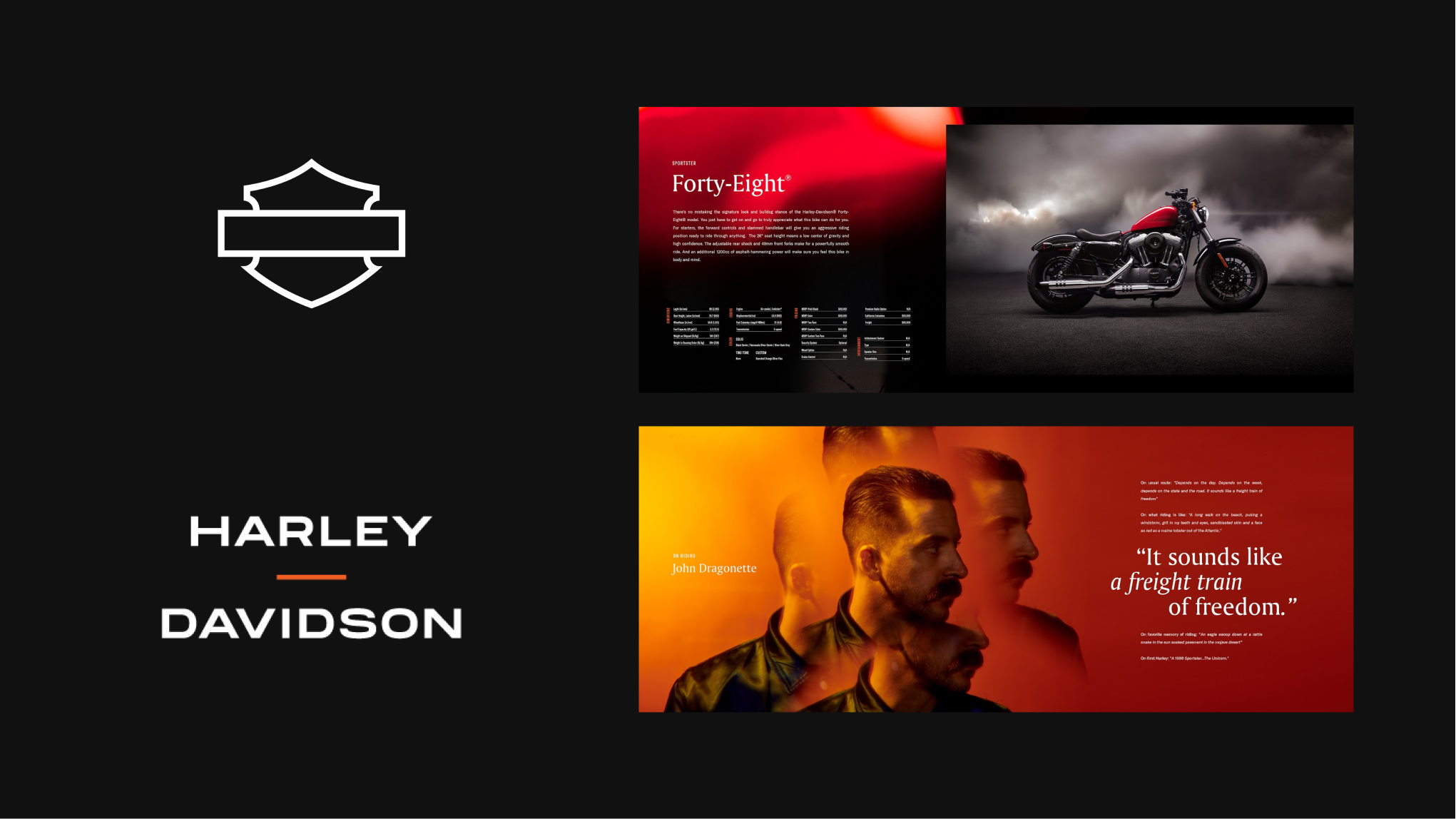
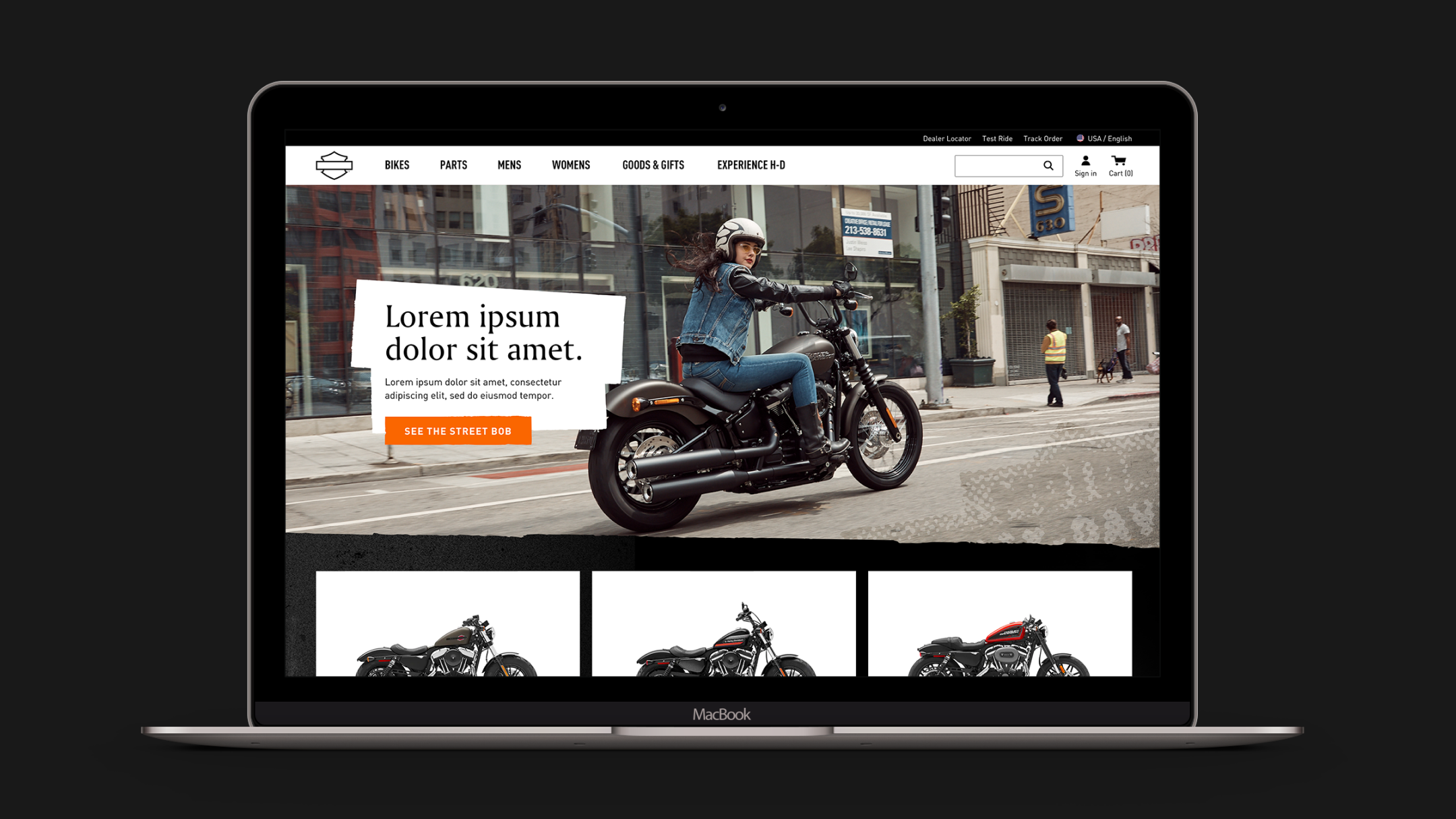
After kicking off with a brief audit of competitors and aspirational examples, Visual Design hit the ground running working parallel with UX. We explored two visual territories illustrating how the new brand comes to life on purely hypothetical pages and some initial components to attain buy-in from clients before deep diving. I led the charge on one of the “hypotheses”, crafting out explorations for the Homepage, Motorcycle PLP and PDP.
INITIAL BRANDING
The re-brand initially focused on a more elevated and spatial approach, with the intent to appeal to a more millenial audience. The brand team chose Amerigo and DIN as the main typefaces, separated the shield and wordmark and shot a slew of new photography, injecting an air of modernity into Harley-Davidson.
DESIGN PRINCIPLES
The three guiding principles of Horizon, Balance and Perspective derived from the new brand approach heavily shaped our design explorations. Following these principles felt natural throughout all our iterations in varying viewport widths and interpretations of components and pages.

Horizon
Balance

Perspective
Once the principles were defined, we had fun with these explorations knowing there are opportunities to keep refining and tweaking the overall visual language as we moved beyond the first sprint.
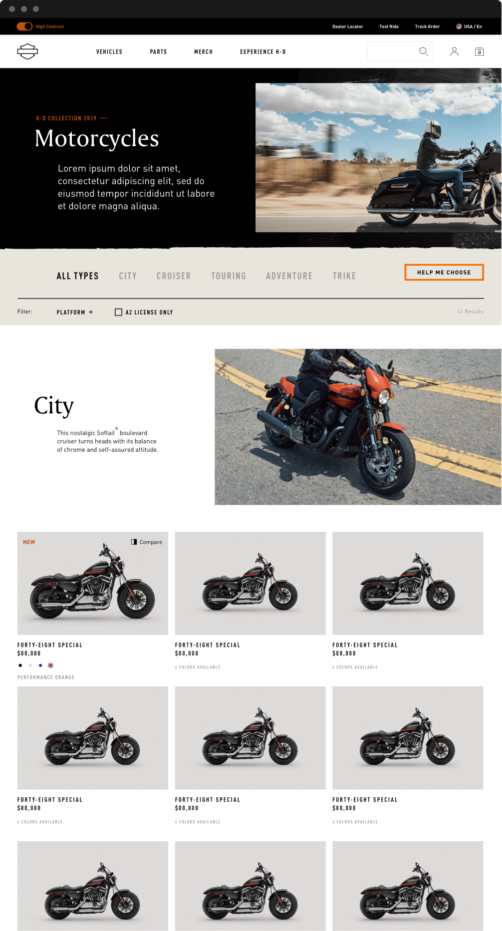
Motorcycle PDP First Pass

Motorcycle PLP First Pass
Motorcycle PLP First Pass
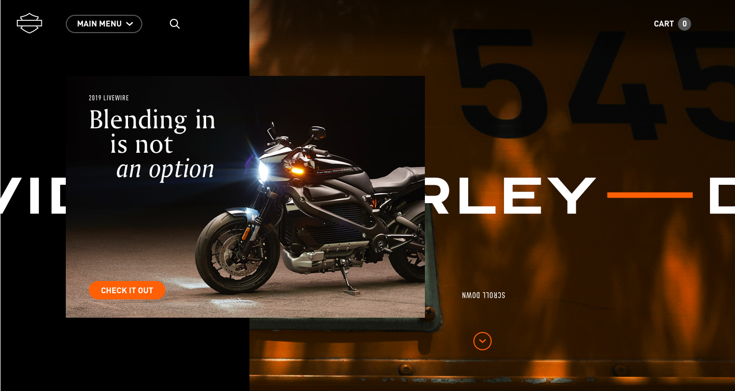
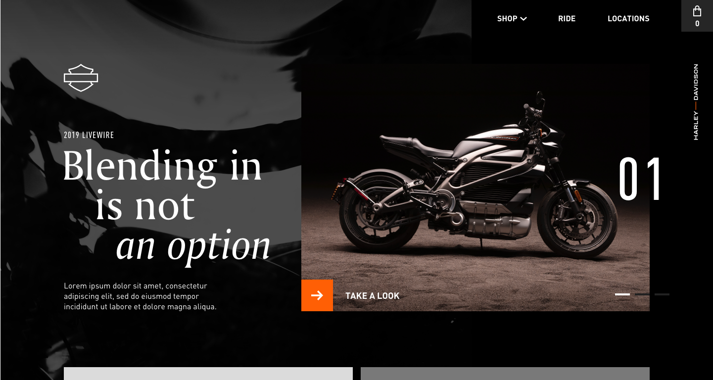
GESTURAL MOTION
From the get-go, we felt that motion played a key role in bringing the new brand to life through interactions and moments. We aimed high, with hopes that clients were open to an elevated level of animation and expressiveness.
GRIT MODIFICATIONS
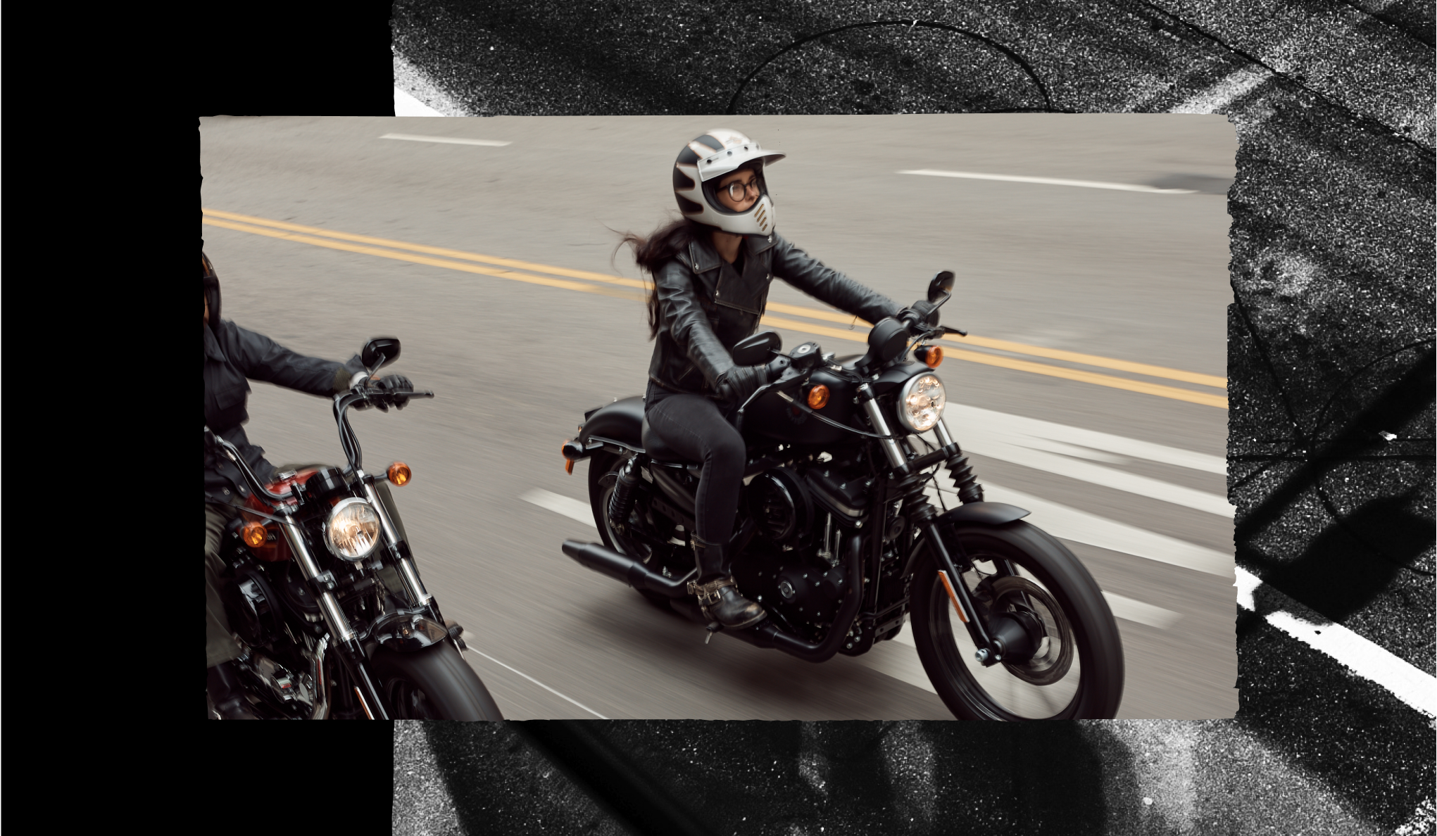
The client’s felt our intial explorations came off too clean, and needed some more character, personality and literal ‘grit’ associated with the Harley-Davidson brand. While we strove to follow a more cinematic and spatial territory to remain faithful to the rebrand, we also explored a territory that tastefully leveraged more textures and grunge.
Homepage with Grit updates
Our first steps saw us develop much of the initial visual languge. Time was of the essence, so we maintained our forward momentum.
END OF PART 1
DISCOVERY
P.2
SPRINTS
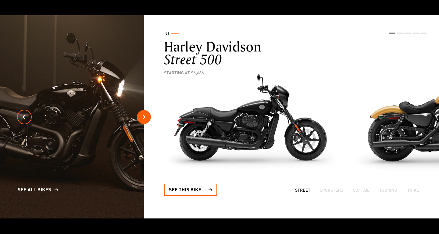
While awaiting further direction from clients and their thoughts on our intial explores, we forged ahead with re-skinning components and constructing pages. With much of the groundwork laid out from our design hypotheses, we split up and tackled components and key pages, collaborating closely with UX and the dev team each step of the way.
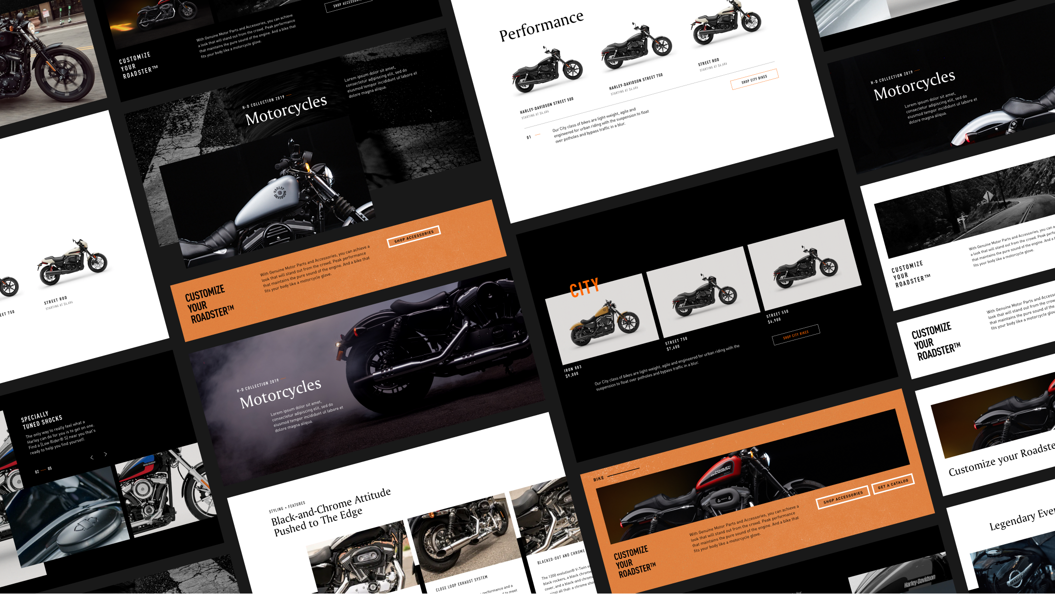
We had a running list of components to design for, inherited from the previous agency that designed the dotcom. Several iterations and states were made for each one, flexing the visual approach while considering the need fto appropriate varying imagery and content.
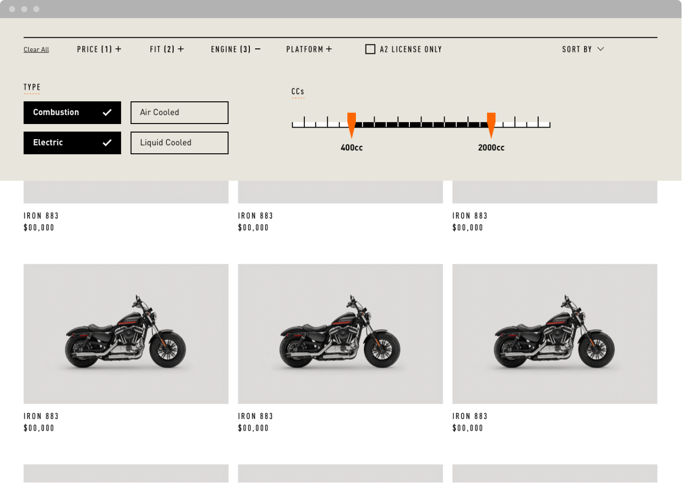
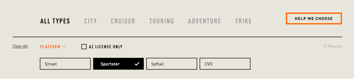
FILTERING EXPLORATION
I was in charge of designing the filtering system for the Motorcycle PLPs, which was an interesting challenge considering variations of features and specifications each category of motorcycle possessed. The filter felt like an opportunity for a brand moment, so we leaned into the language of gauges and speedometers for the sliders.
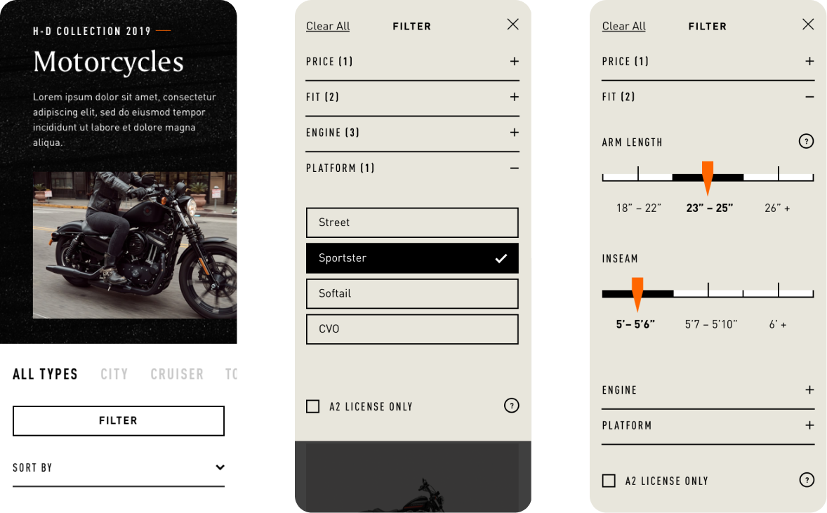
Mobile Filtering First Pass
Desktop Filtering First Pass
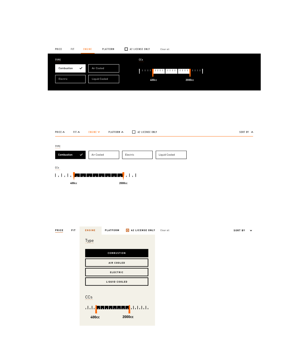
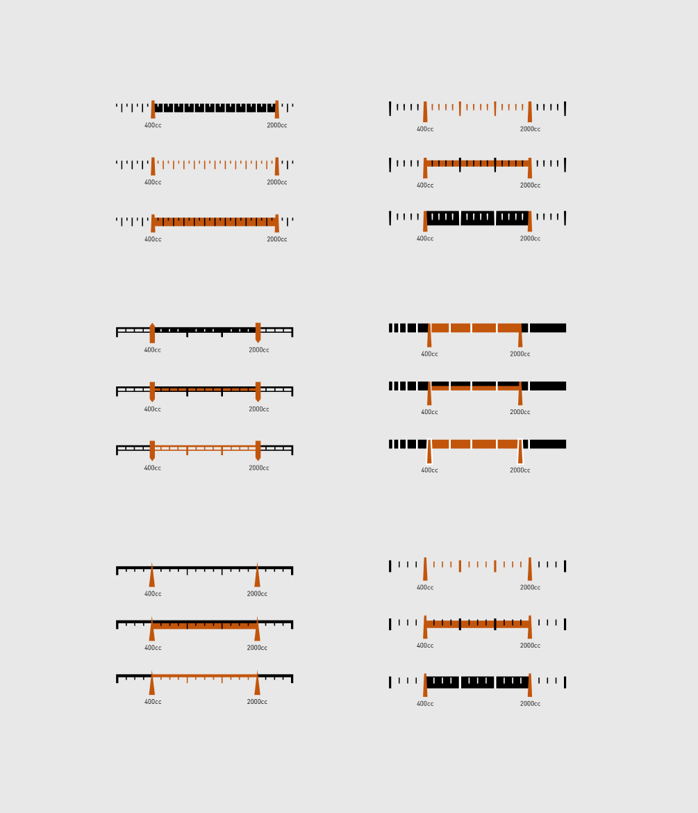
While it was fun while the idea lasted, we ultimately realized that it was best to keep the filter design relatively straightforward. Our clients agreed, focused on keeping the interaction succint.
Updated Filtering Component
Motorcycle PLP
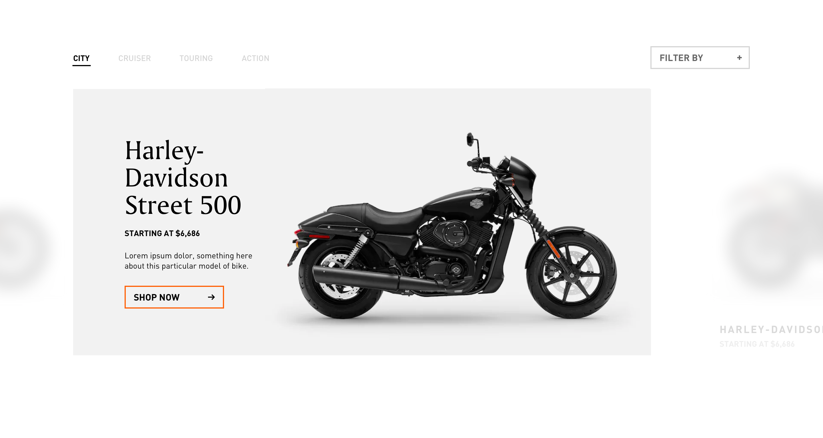
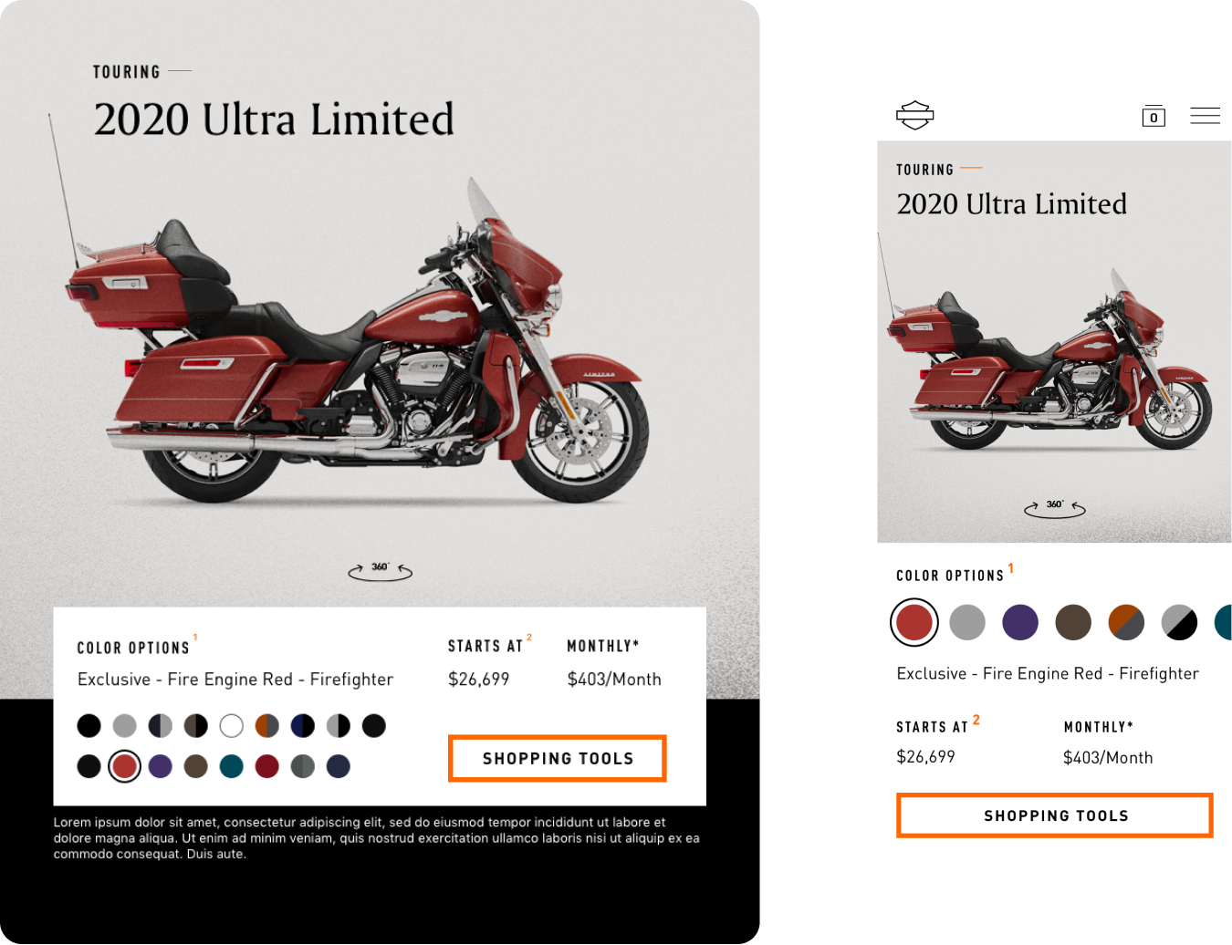
PDP PRODUCT INFO BAR
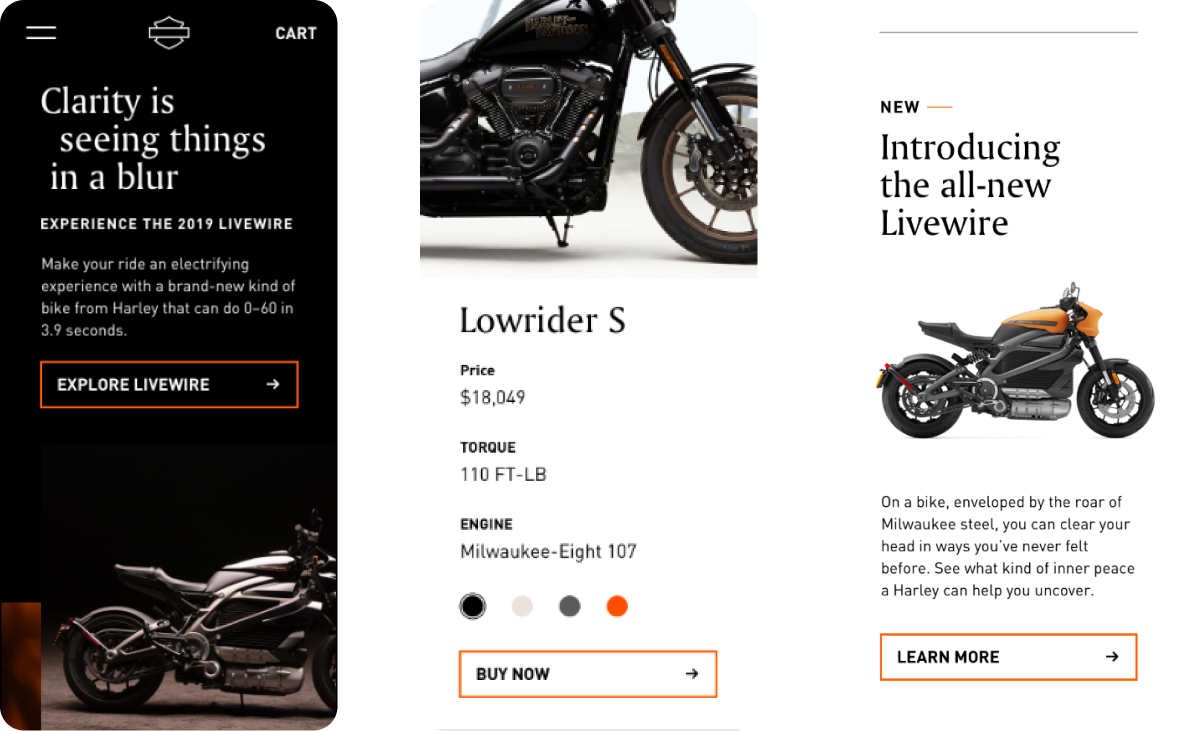
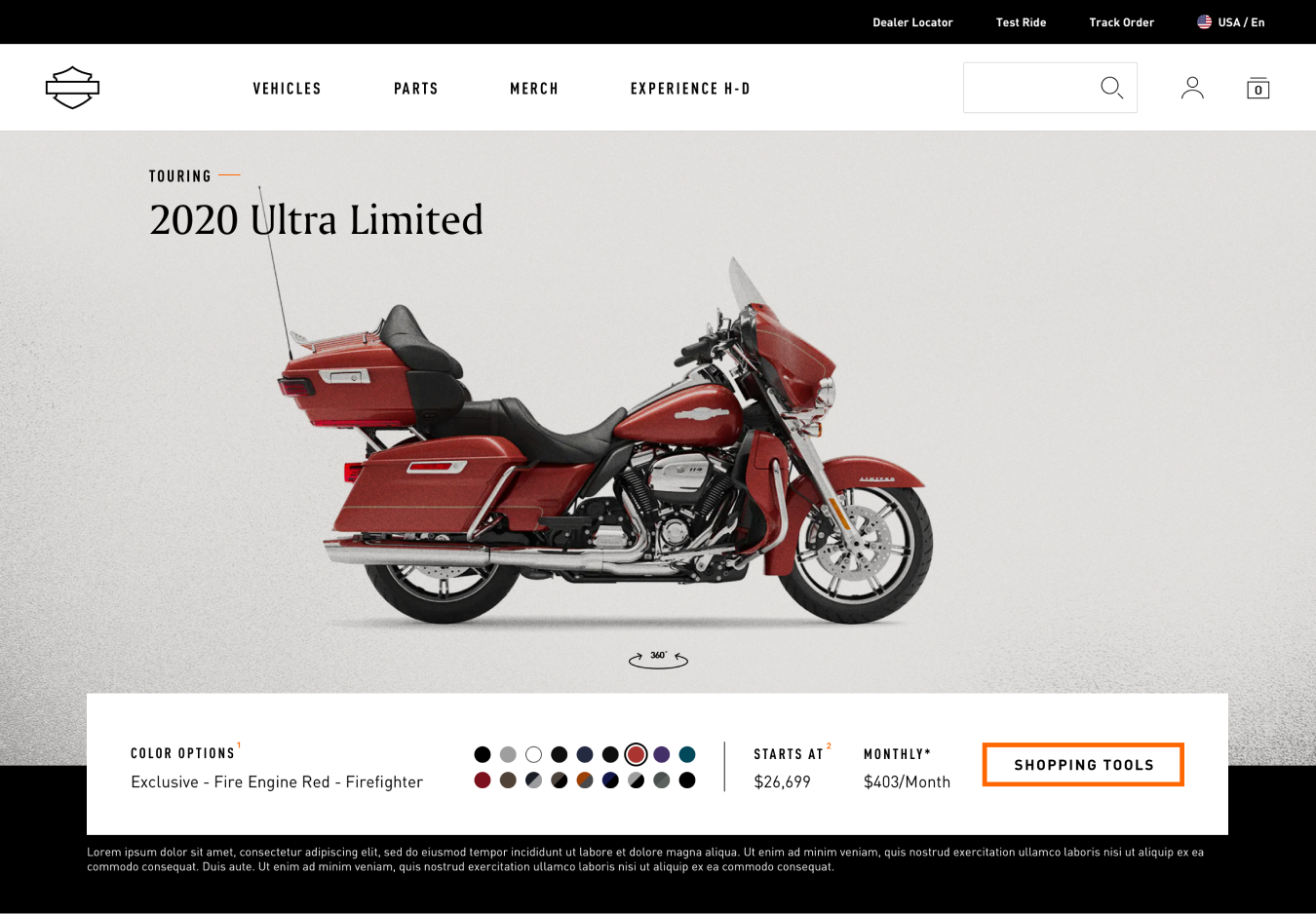
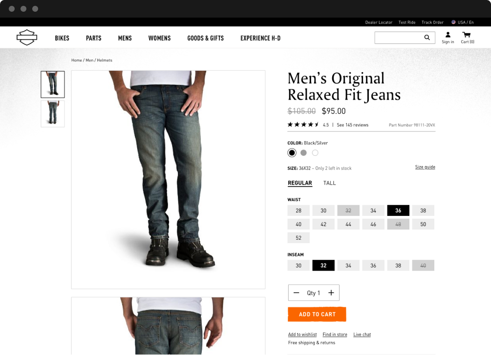
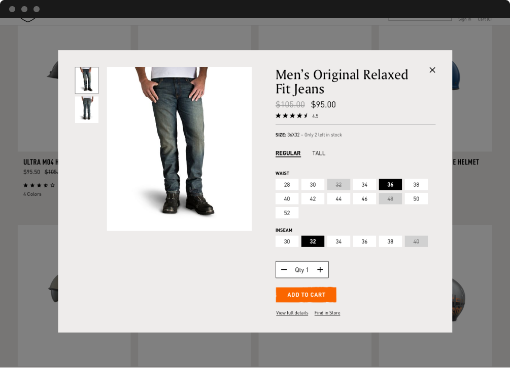
Our design for the Motorcycle PDP prominently features a rotatable hero preview of the bike, and a concise product information bar containing pricing and color swatches that can be toggled. Maintaining conciseness while accommodating for immense amounts of color variation between bikes proved interesting to try to figure out.
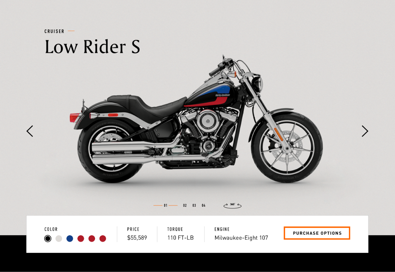
First Info Bar Exploration
The first exploration felt nice but lacked the proofing for fitting the colors, color names and flexibility on multiple viewports. Some bikes only had two colorways while there were some that had up to 18, combined with lengthy color combination names up to 40 characters long.
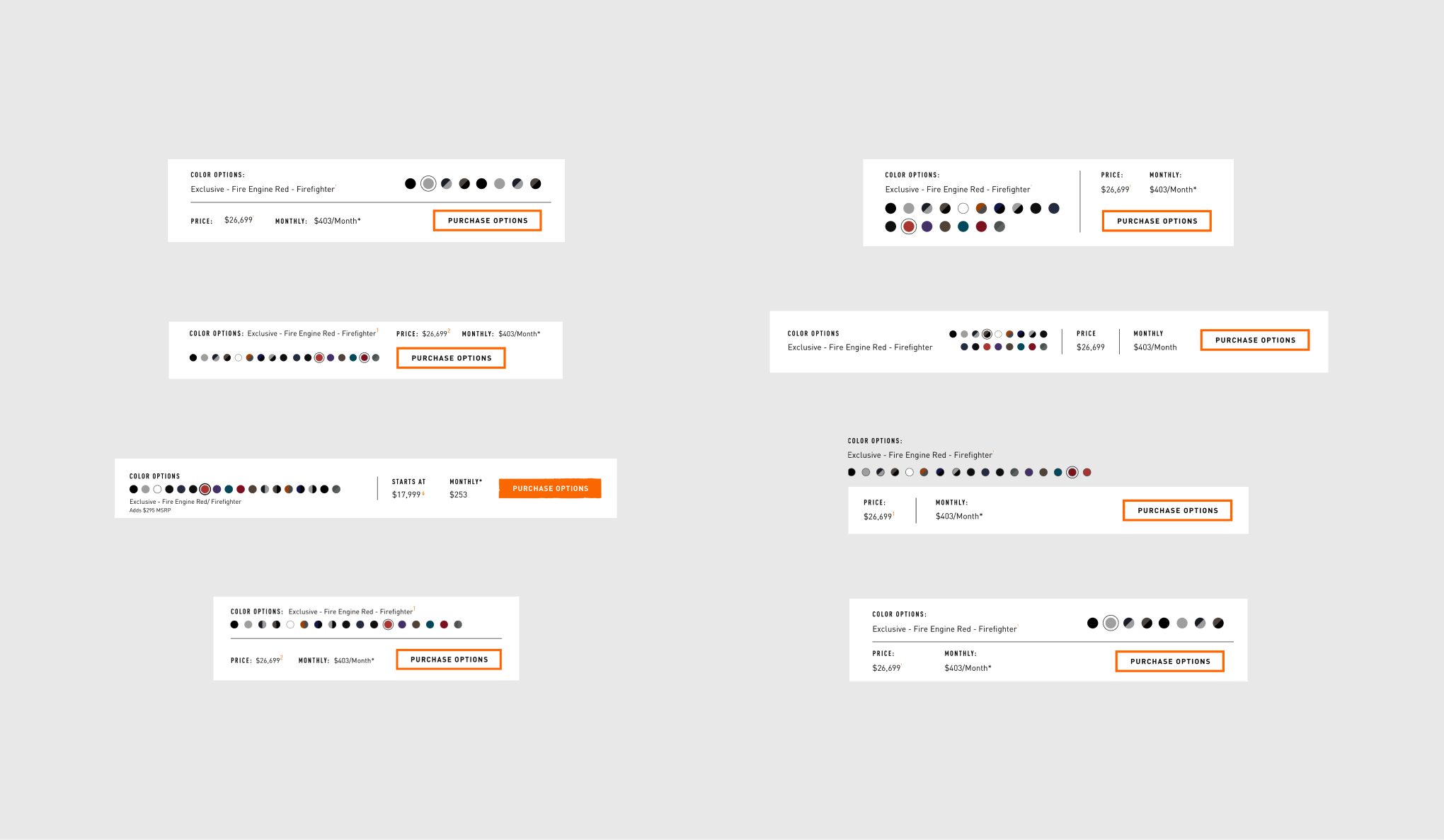
Motorcycle Info Bar Explorations
Desktop Filter with Maximum Swatches
I designed for the worst-case scenario and worked backwards. Creating different states of the Product Info Bar depending on the amount of swatches and viewport, closely checking with the developers to ensure they are aware and approve of the approaches.
Filtering on Tablet & Mobile
Our goal hinged on making our components as robust as possible, with Harly-Davidson’s immense portfolio of products in mind.
END OF PART 2
SPRINTS
P.3
DESIGN PIVOT
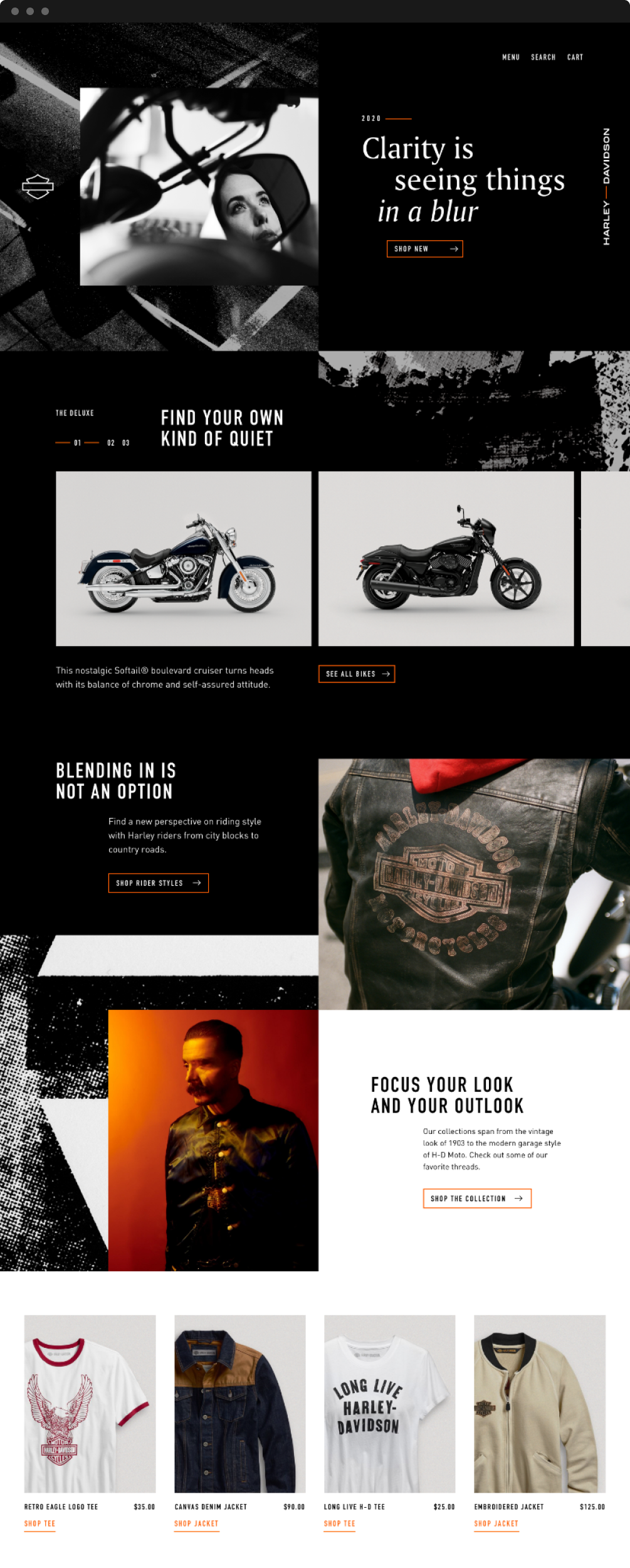
We received a request to add more ‘grit’ and weathering to the entire site. The branding was now moving in a direction that incorporated much more ruggedness, weight and imperfection to the overall visual language. We worked hard to reflect this new direction while maintaining the working cadence we’ve already established.
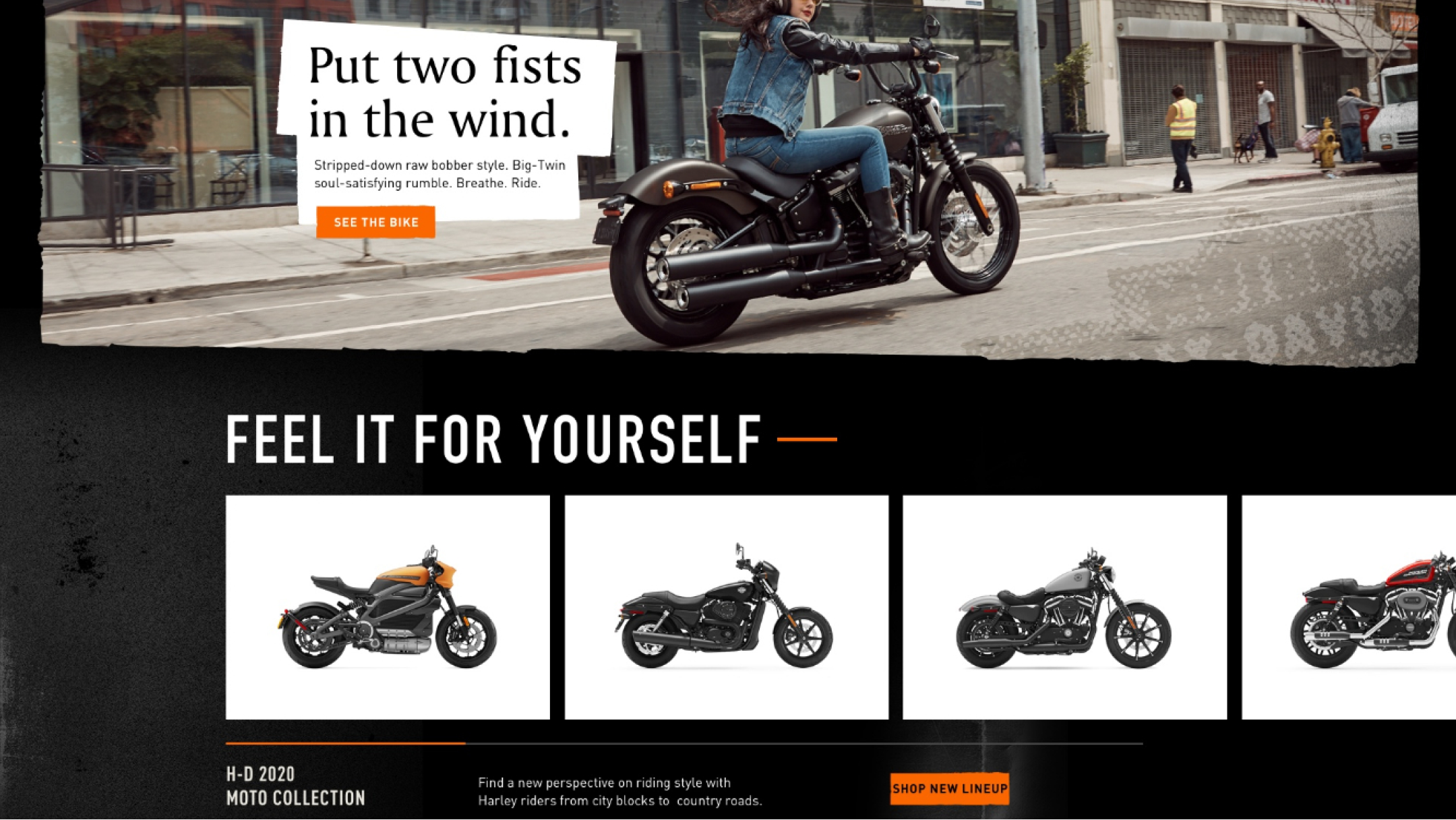
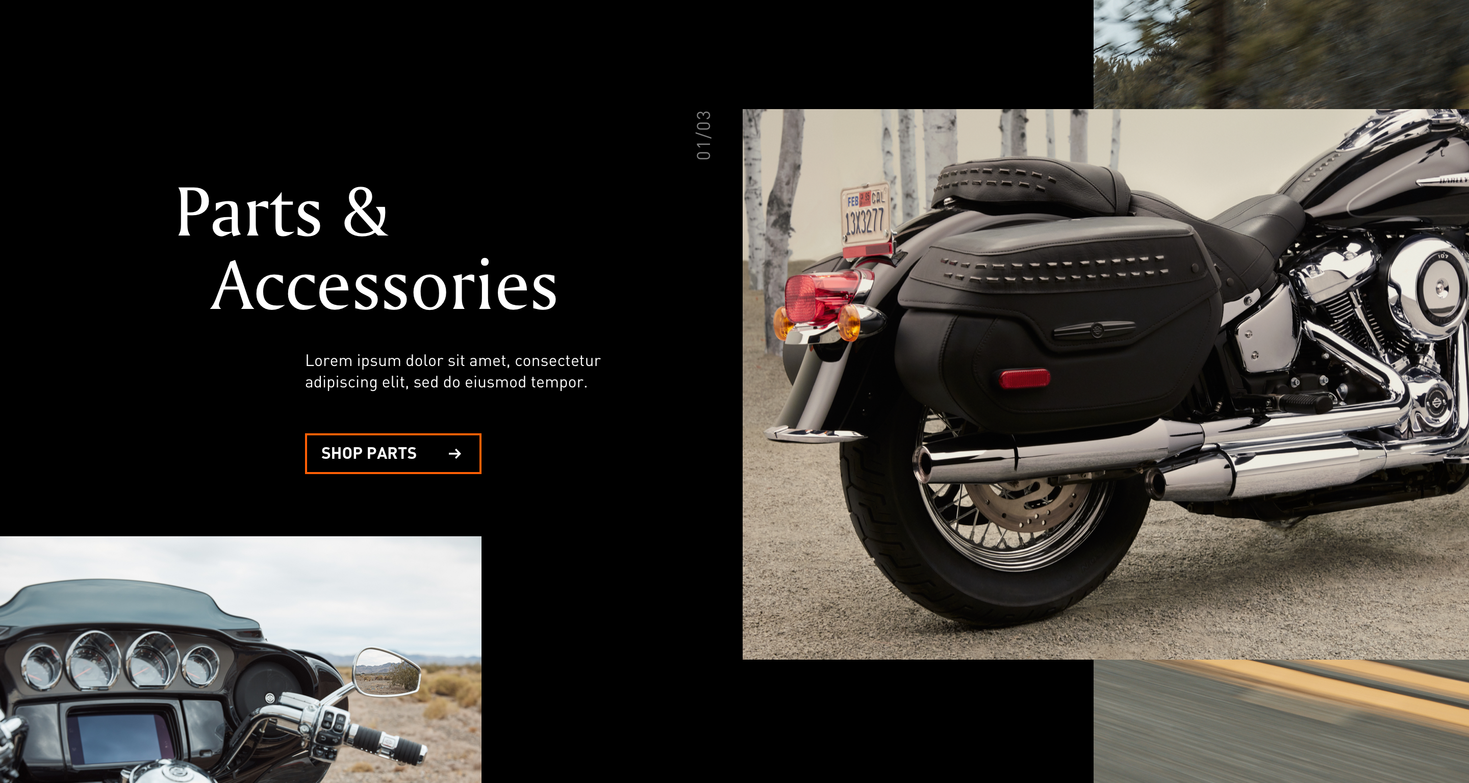
THE GRIT FACTOR
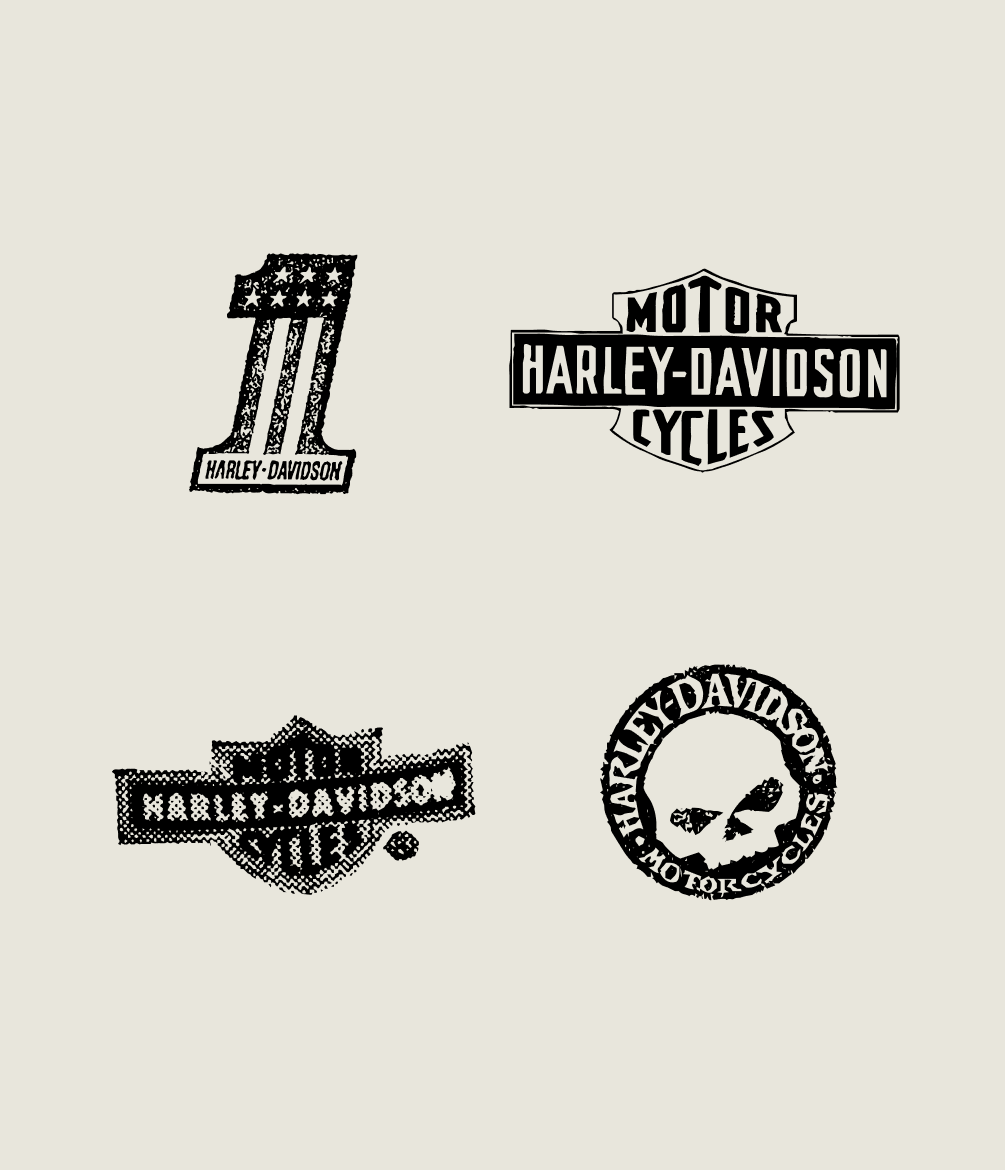
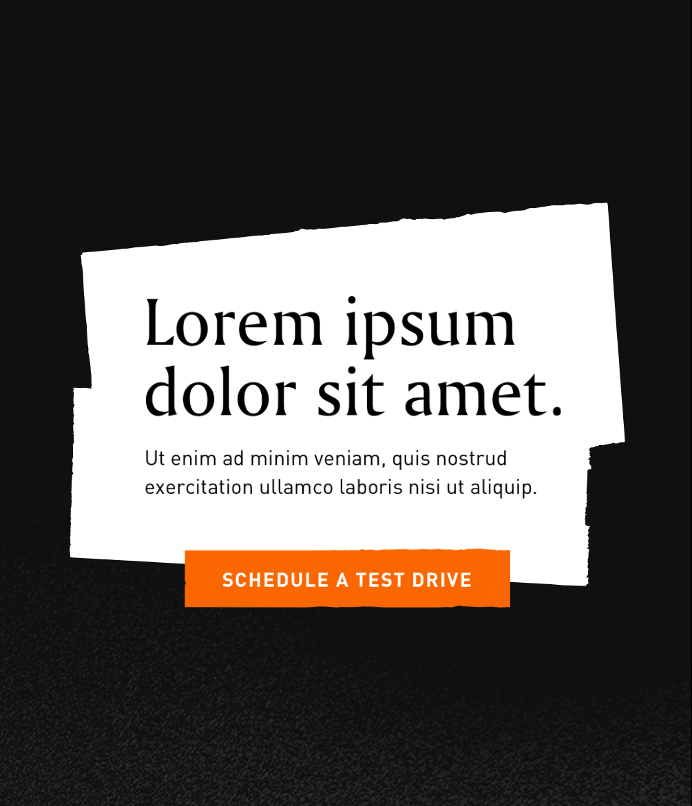
We added a plethora of elements to help inject some more grit and weathering. Imagery modules used an SVG mask to create the illusion of ragged edges, noise and grundge vignettes occupied edges, H-D heritage logos were used as stamps on photography and a new off-white color was added.
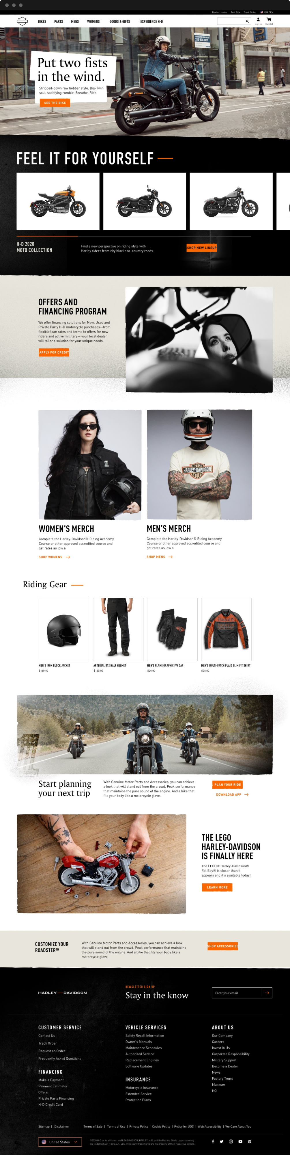
Homepage Redesign
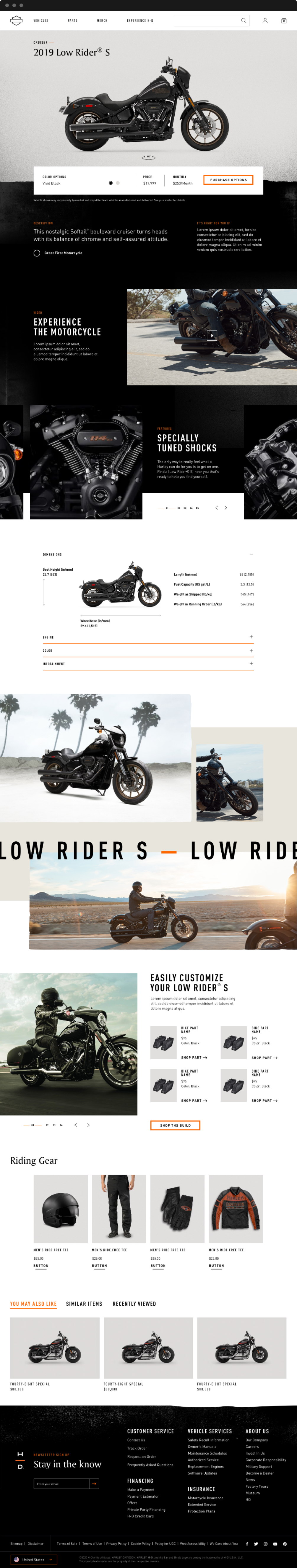
Motorcycle PDP Redesign
While the change in design approach was a challenge to accommodate, we collectively felt it was the right move for the brand.
END OF PART 3
DESIGN PIVOT
P.4
ROAD TO RELEASE
Honing in on the newest design direction, I shifted gears towards fleshing out the Parts & Accessories PDPs and PLPs after updating the more Motorcycle centric pages to a visual direction that clients were pleased with. It helped that much of the design exploration at this point was locked in, allowing us to move fast and more efficiently through the process of the remainder of components and pages.
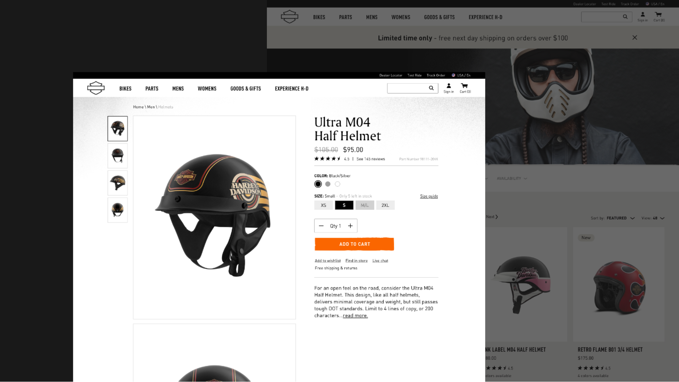
PRODUCT DETAIL PAGES
While we were happy with how the Motorcycle pages were progressing, work begun on PDPs and PLPs for both General Merchandise and bike Parts & Accessories. The challenge here was to ensure there were sufficient states to accommodate the wide variety of product offerings and also incorporate more contemporary e-commerce design conventions while maintaining the gritty visual approach.
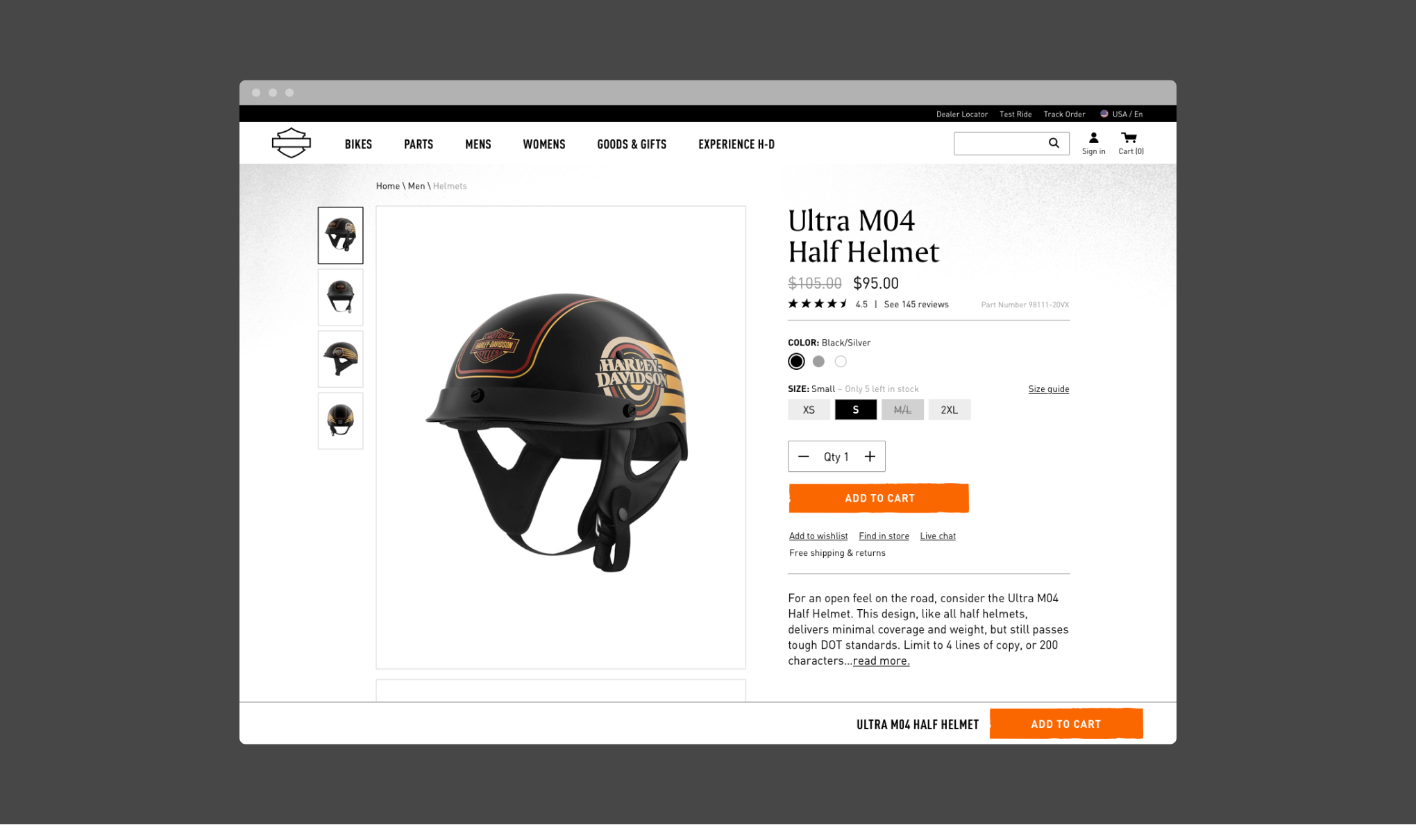
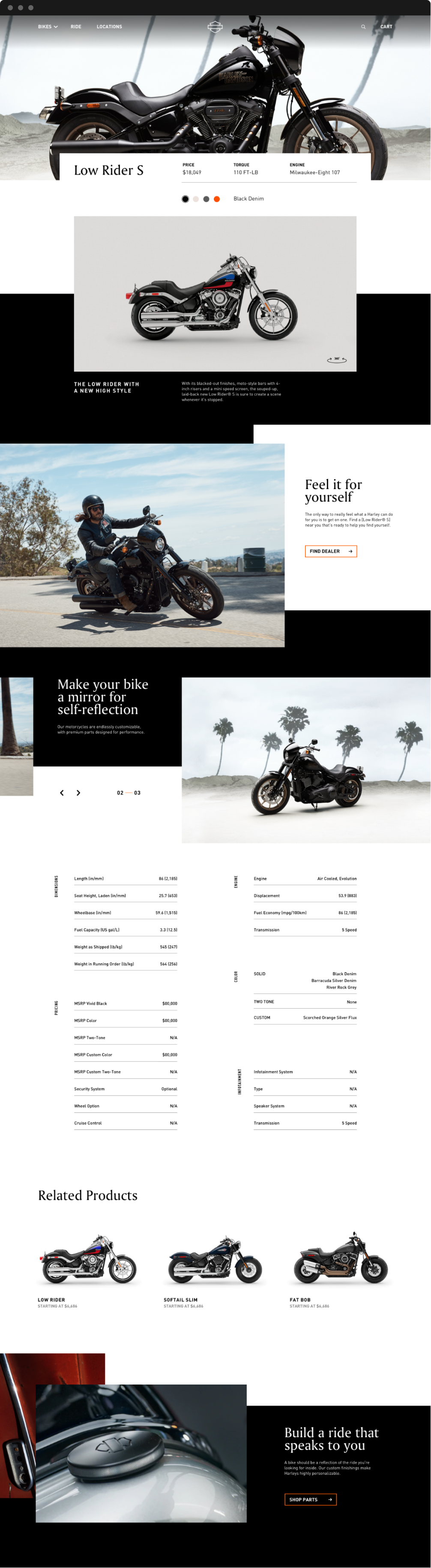
There was a need to innovate upon the established structure of the old site’s PDP to ensure a consistent transition to the new site. We took the approach of a scrolling image gallery with product information locked onto the right side which felt much more updated. For these pages we also toned down the amount of grit and weathering.
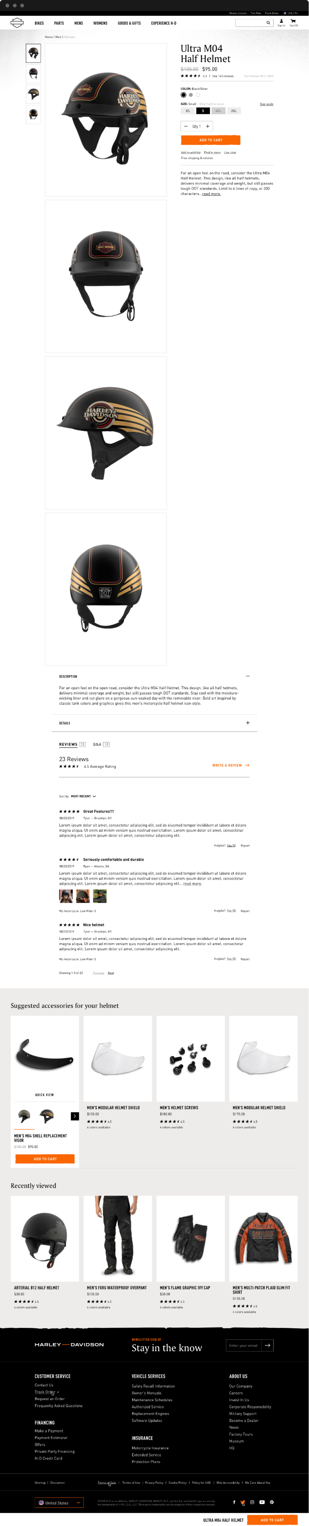
General Merchandise PDP Desktop
General Merchandise PDP Mobile
Apparel Desktop PDP
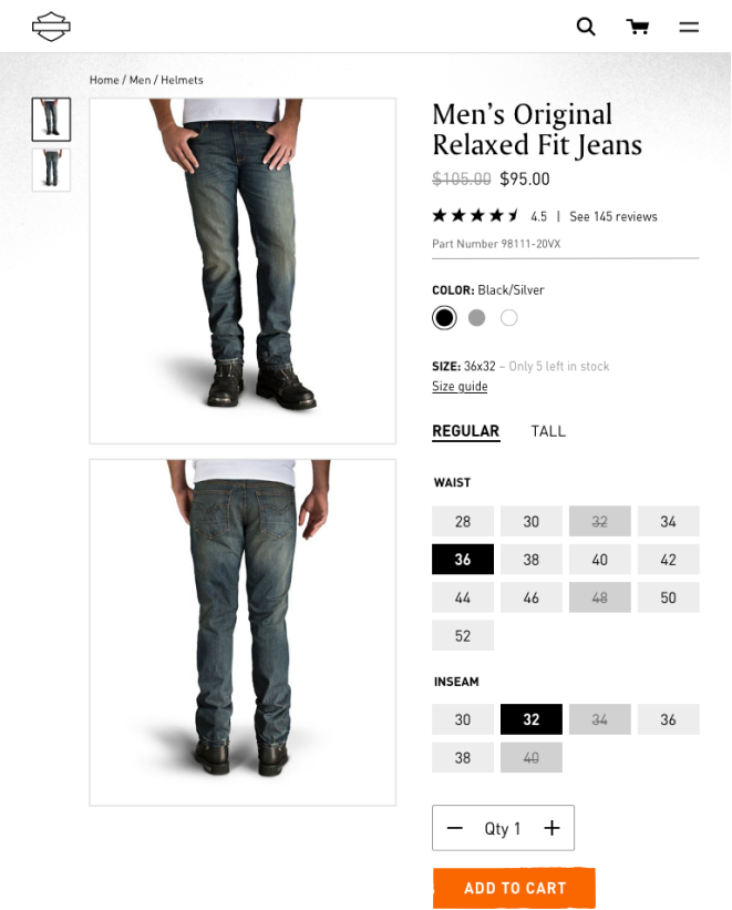
Apparel Tablet PDP
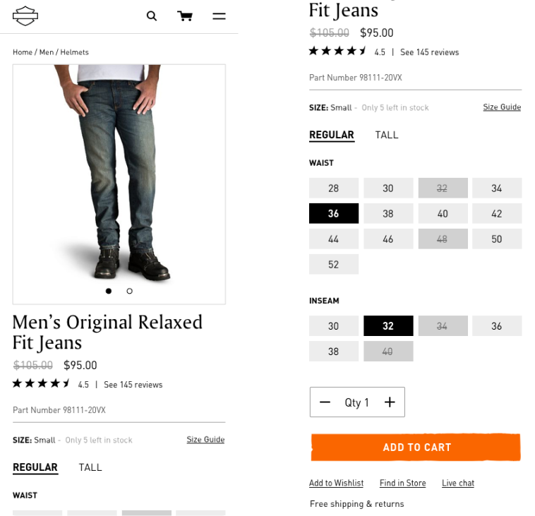
Apparel Mobile PDP
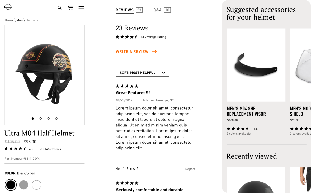
PRODUCT LIST PAGES
In addition to refining the product detail pages, we made a significant push to flesh out the product list and category pages. There were similar challenges especially when it came to designing product cards and their various states.
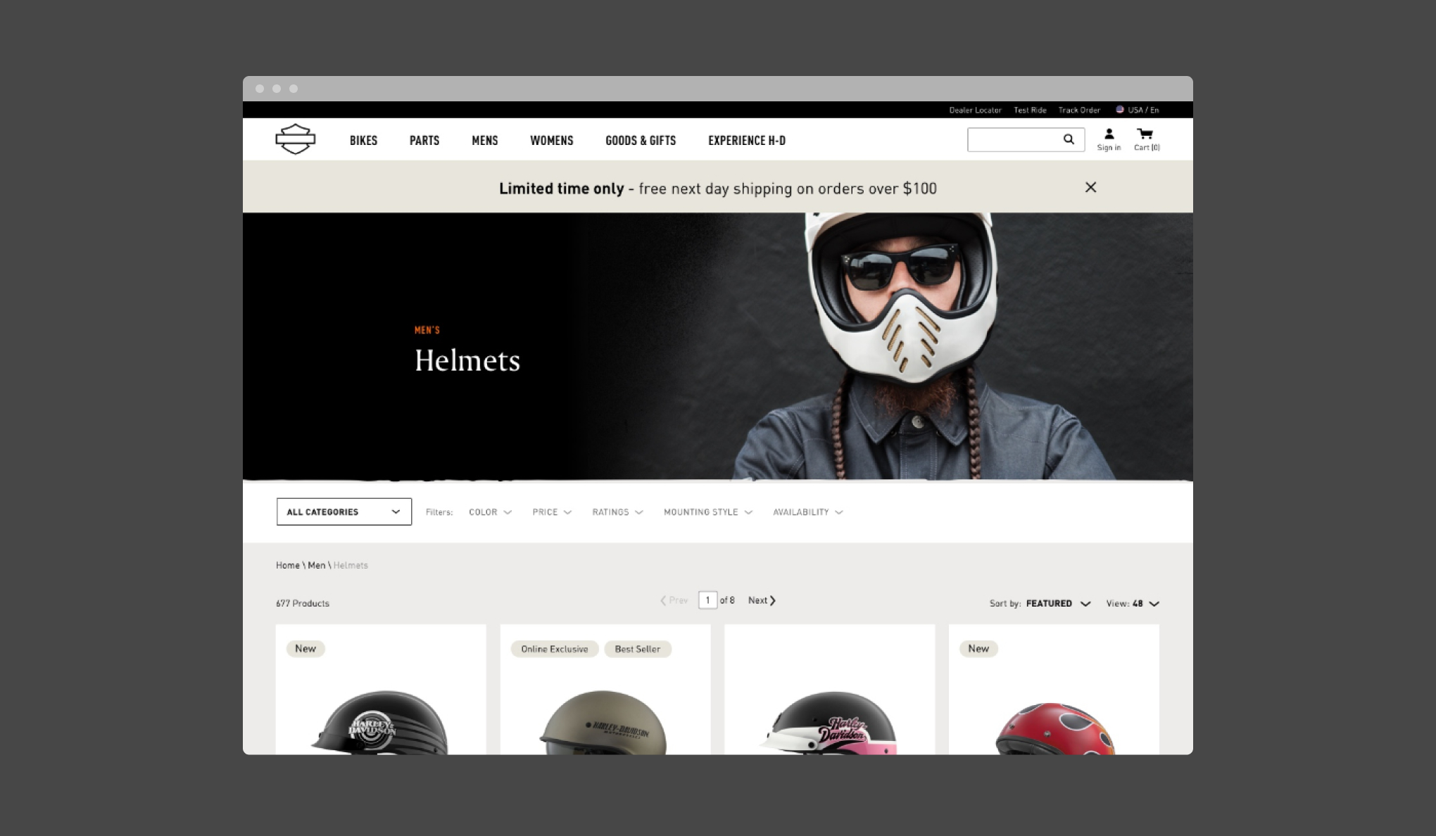
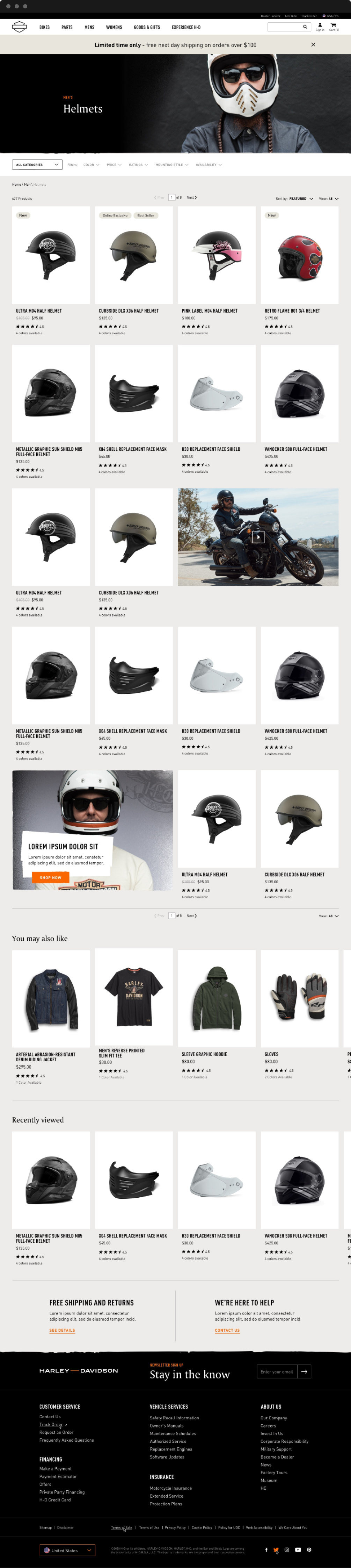
General Merchandise Desktop PLP
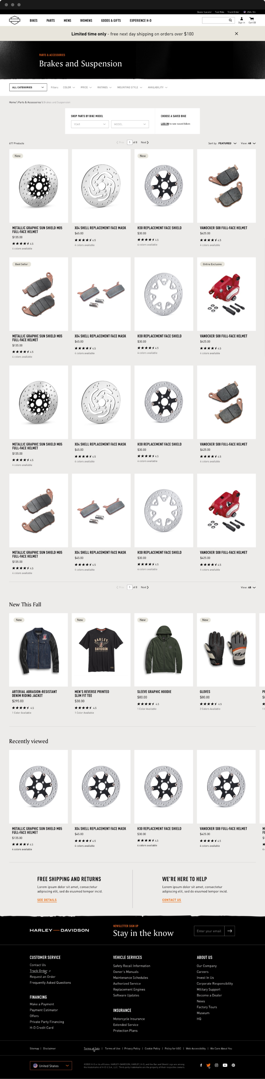
Parts & Accessories Desktop PLP
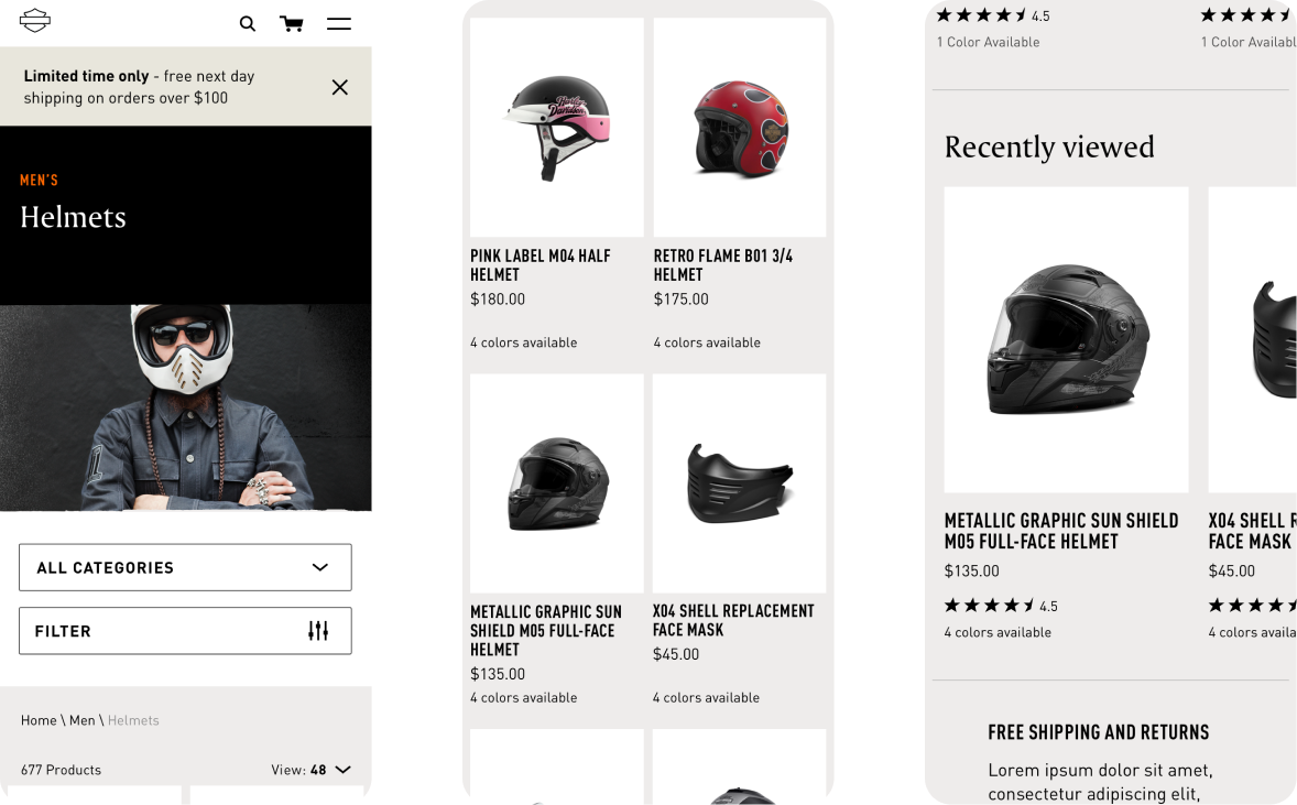
Parts & Accessories Mobile PLP
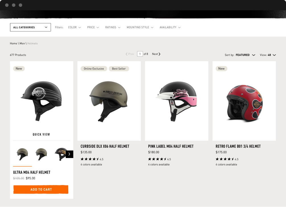
Gear Card Hover
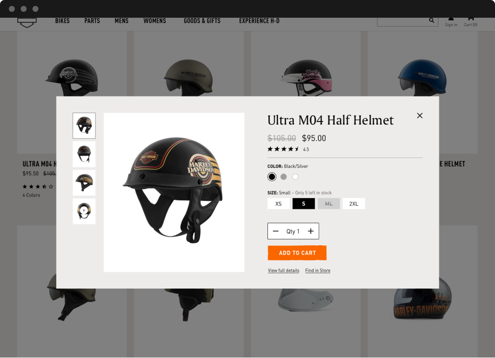
Gear Card Quick Look
Apparel Quick Look
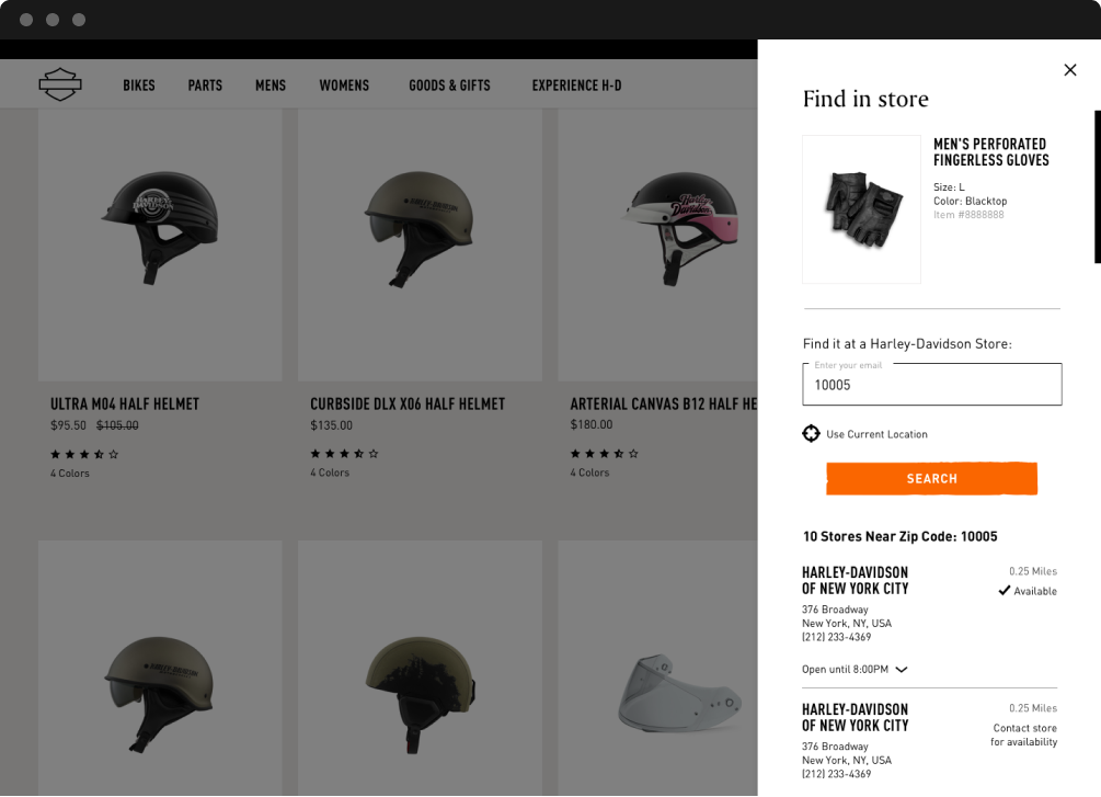
Gear Card Find In Store
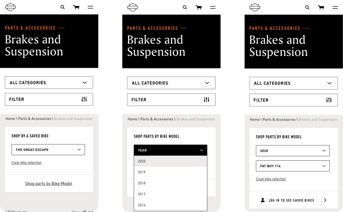
Parts & Accessories PLP Filter
As we progressed towards launch, it was an entire team effort to keep refining every single component and align clients on changes.
END OF PART 4
ROAD TO RELEASE
P.5
LAUNCH
We did it! While the first iteration of the site launched in January, the full global rollout of Harley-Davidson.com launched in June with full international language support. The clients were extremely pleased with the end result, and felt this was one of their first steps towards capturing net positive sales and getting new consumers on board with the brand.
CONCLUSION
Personally, this project was a culmination of a lot of skills and learnings I have tried to develop over the past few years and could not have asked for a better opportunity to flex them and to be challenged.
