HARLEY-DAVIDSON
DURATION
JUNE 2019–JUNE 2020
ASK
WEB DESIGN
MOTION GRAPHICS
ROLE
SENIOR DESIGNER
AGENCY
DROGA5
ACCENTURE
Harley-Davidson came to Droga5 with the ambitious task to re-think both their branding and e-commerce experience. I was part of the team to design and build a fully responsive, AA compliant, AEM-built, component-driven website, working through an initial 6 agile sprints to a hard launch in January 2020 with complete feature and international roll out by Summer 2020.
Adopting the fresh rebrand built by our brand team, we sought to elevate the iconic American brand’s online shopping experience.
THE PROBLEM
Harley-Davidson is undeniably synonymous with ‘Freedom’ and ‘Americana’, embodying the spirit and exhilaration of the open road and the satisfaction of riding a well-built machine. Unfortunately, the brand has seen a consistent decline in relevancy and overall sales throughout the past few years.
As an agency, we were brought in to modernize and reignite the brand to help it resonate with a wider breadth of consumers. Part of this endeavour was drastically overhauling their e-commerce presence so they can stand up to their competitors within the category.
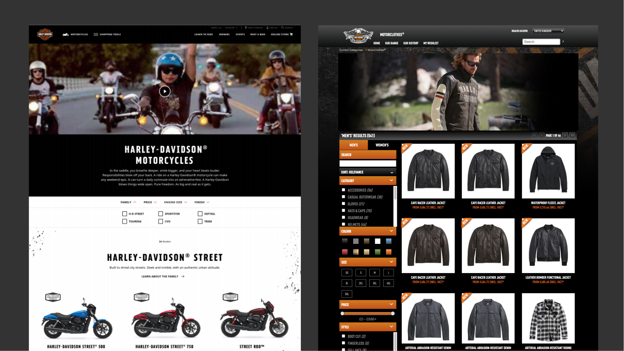
Original Motorcycles and GM/P&A sites.
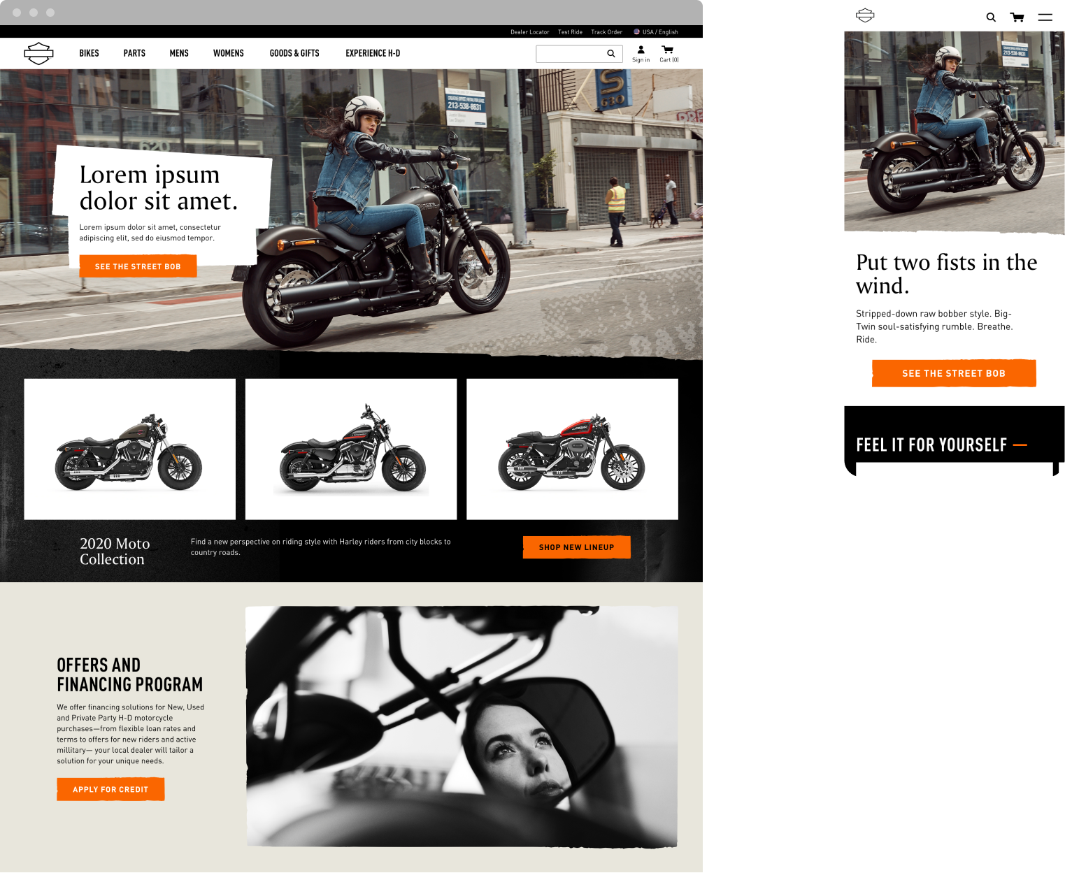
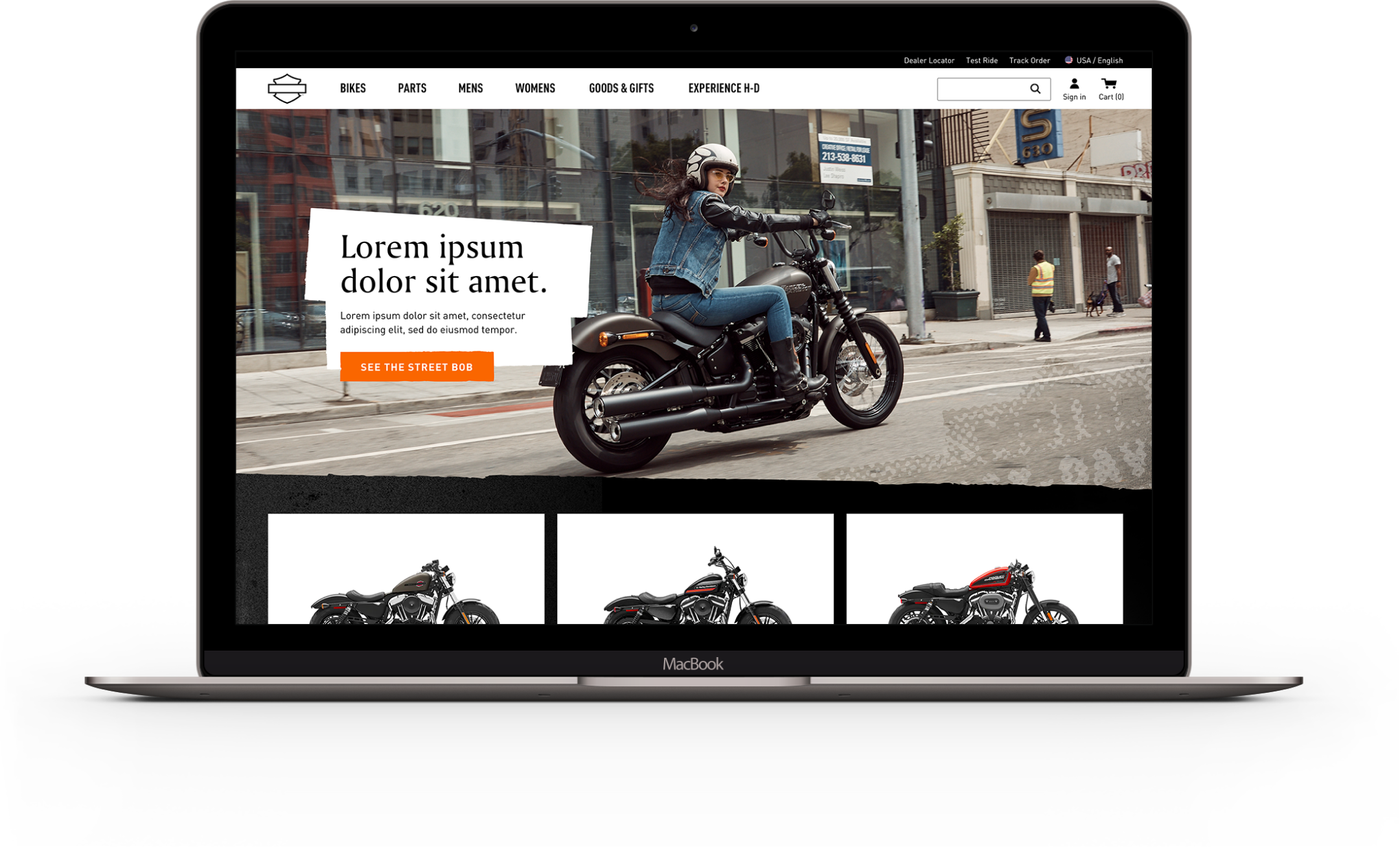
Their online shopping felt dated and disconnected at almost every touchpoint. Product lines were split between two separate websites—one for bikes and the other for parts, accessories and apparel. Both of these sites had radically different designs and did not feel like they were part of the same ecosystem.
THE APPROACH
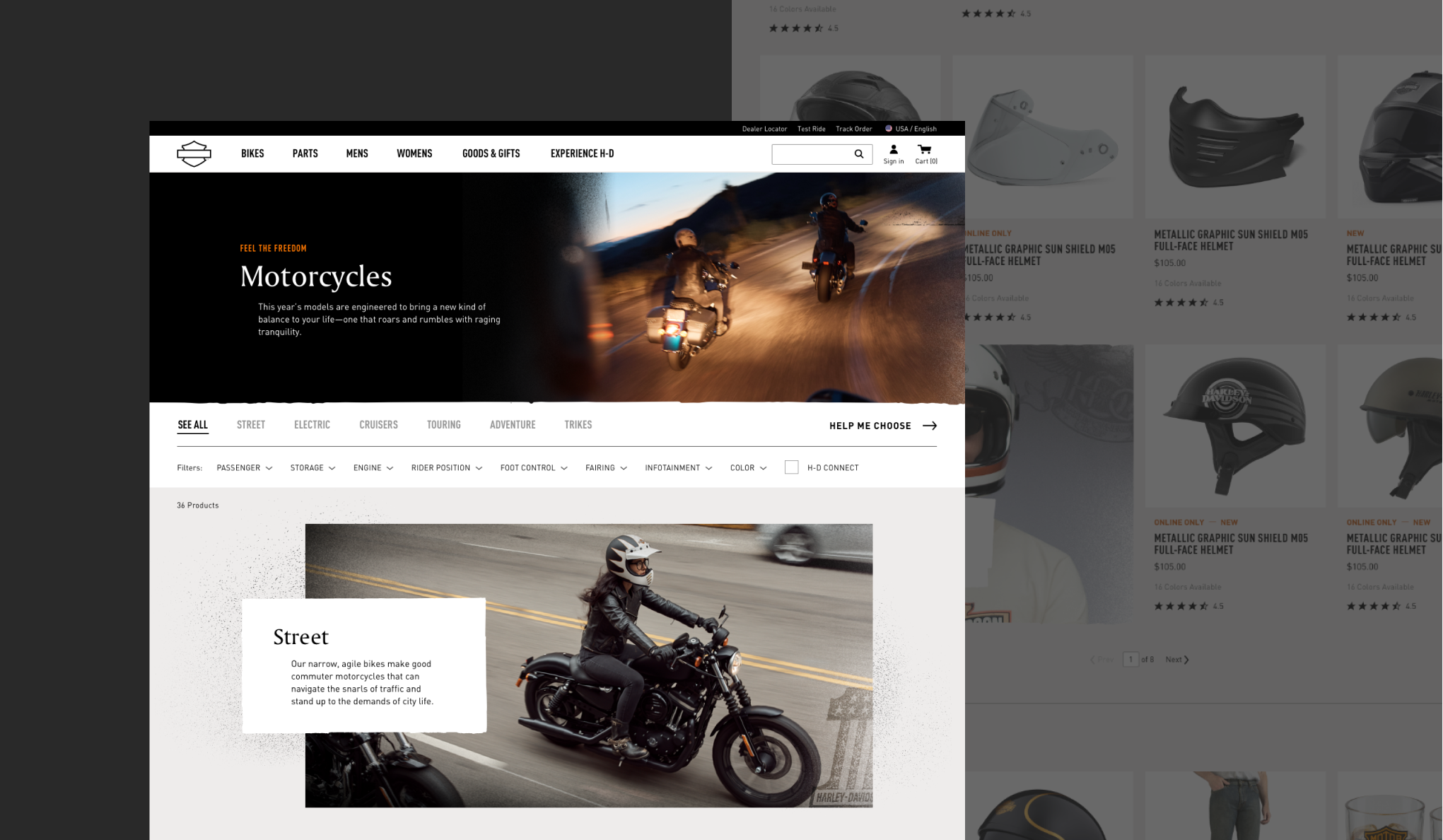
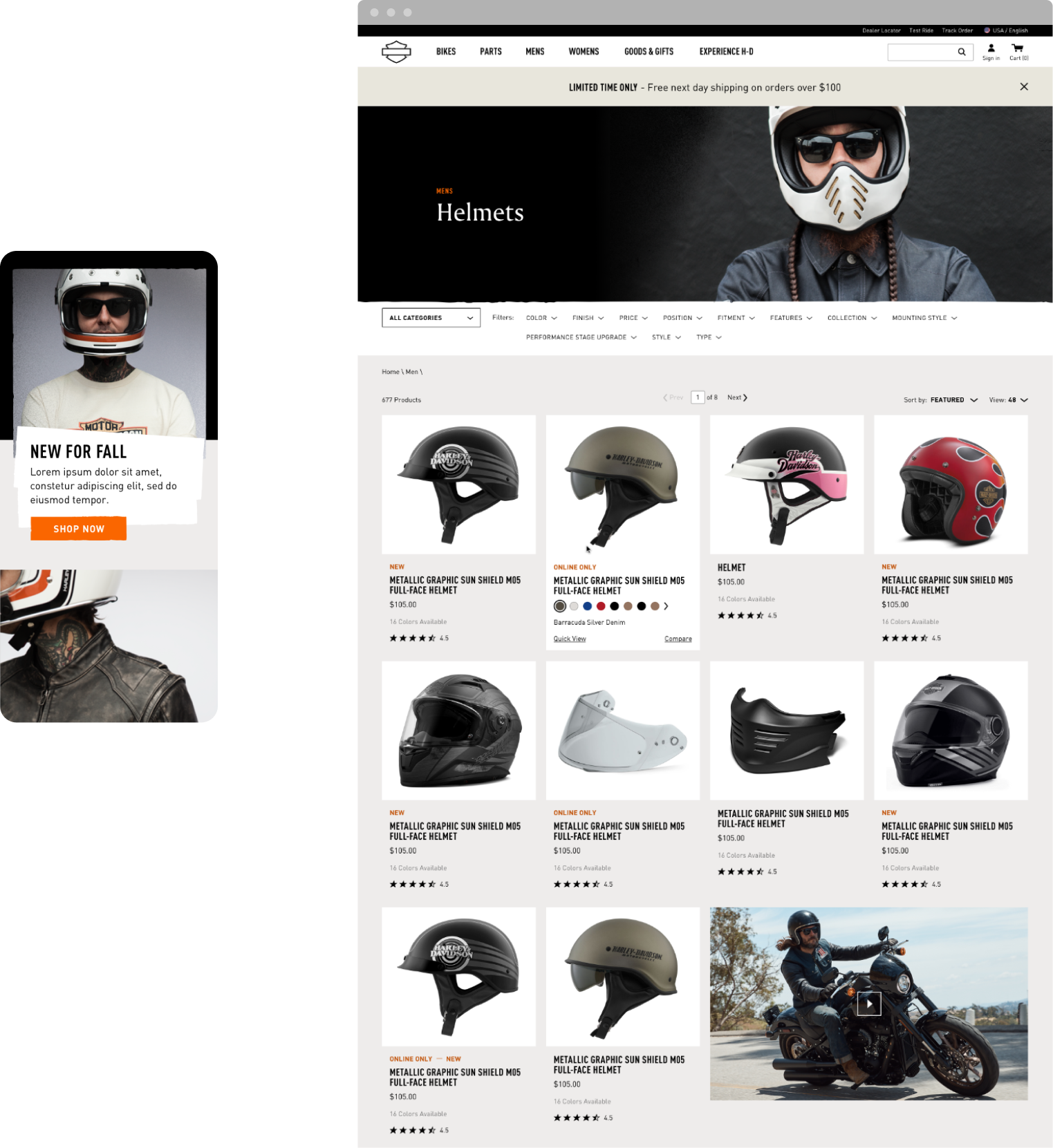
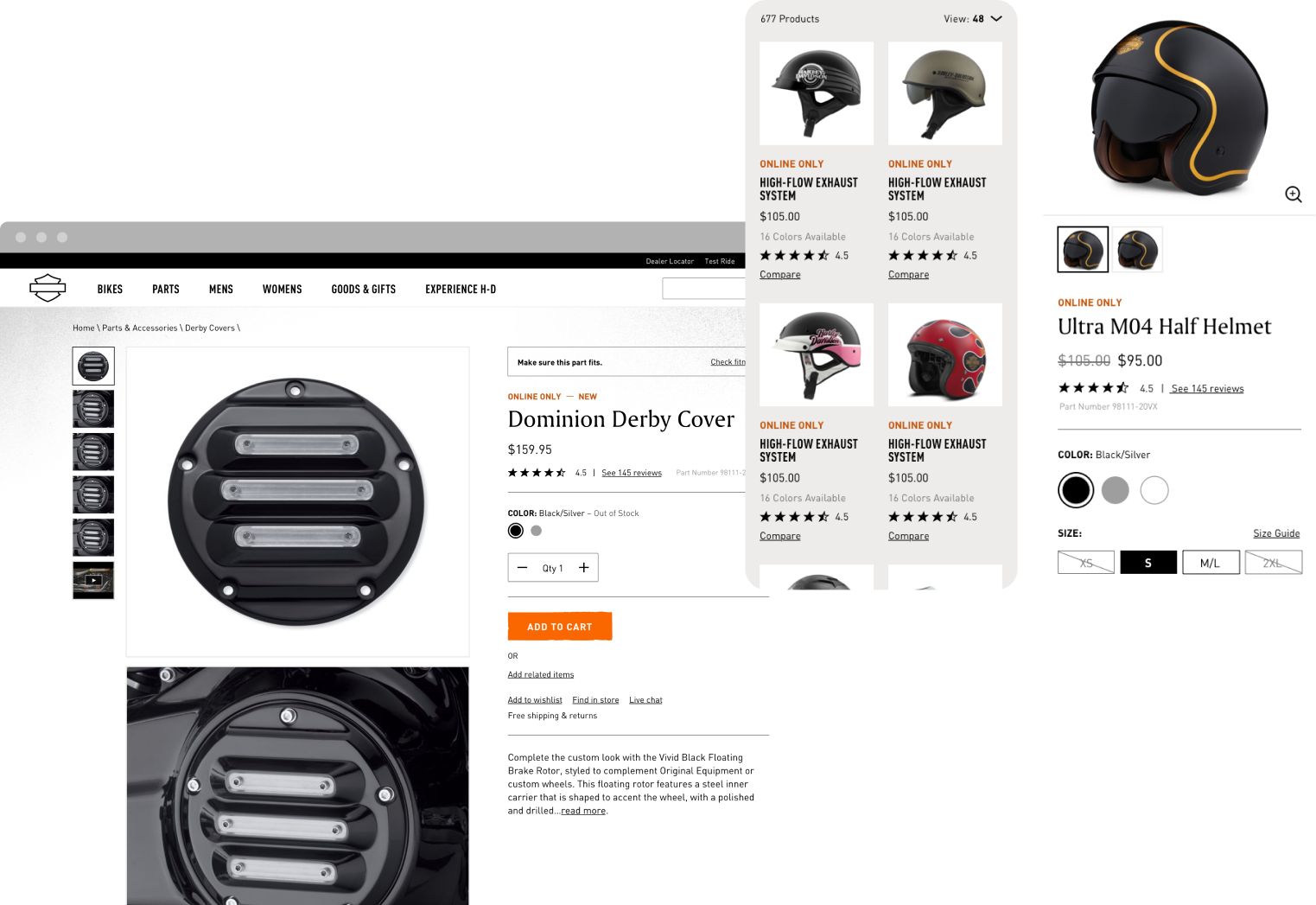
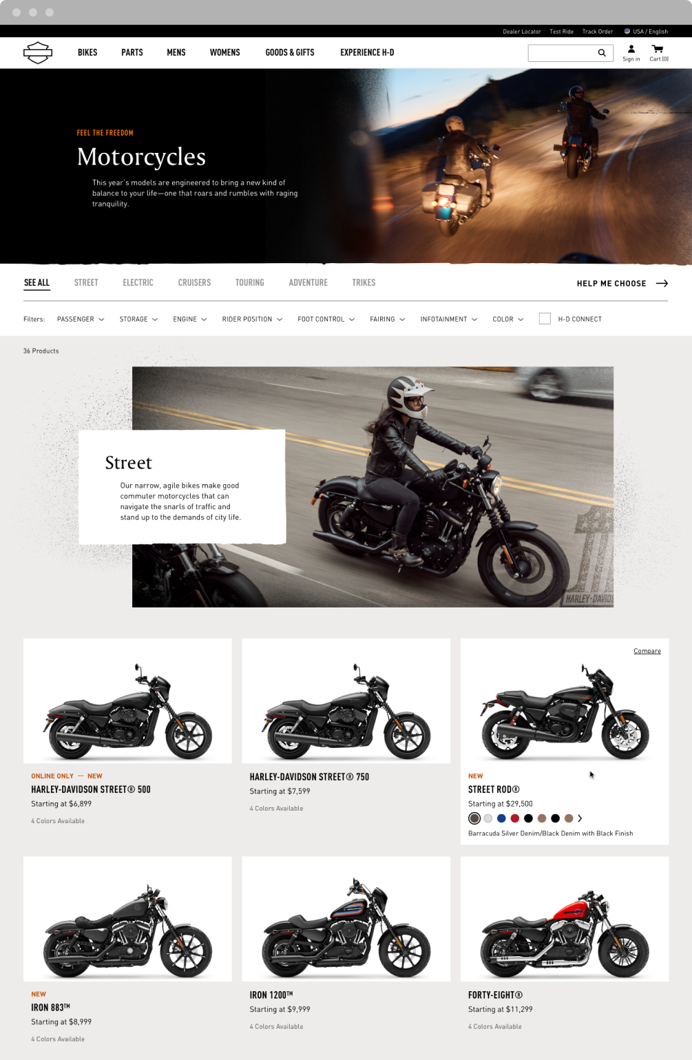
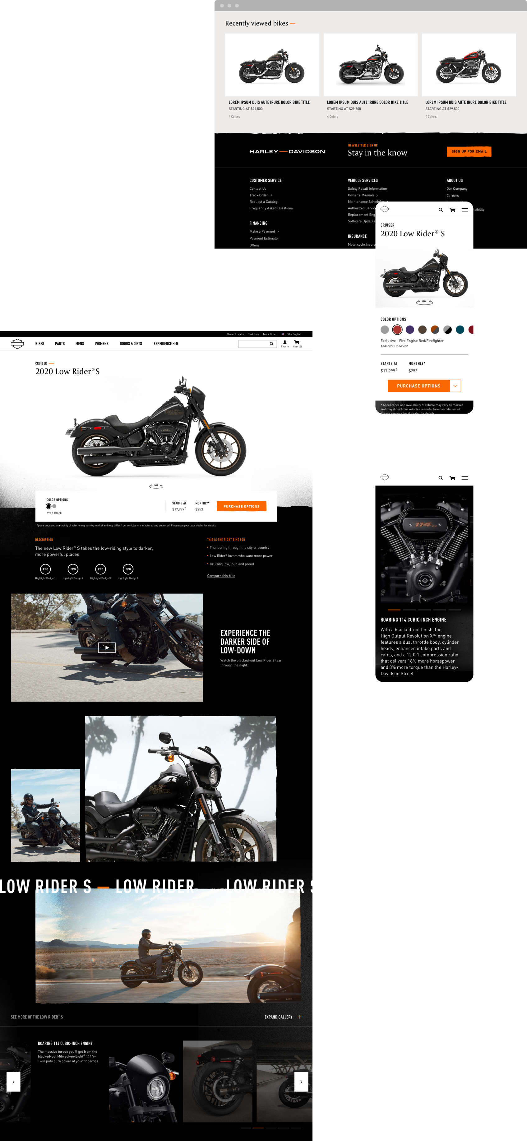
We merged these two sites together into one comprehensive platform, reskinning the plethora of inherited components from the original site and sought opportunities to create net new pages and components while pushing the visual design and retaining dev feasibility.
UPDATED
BRAND IDENTITY
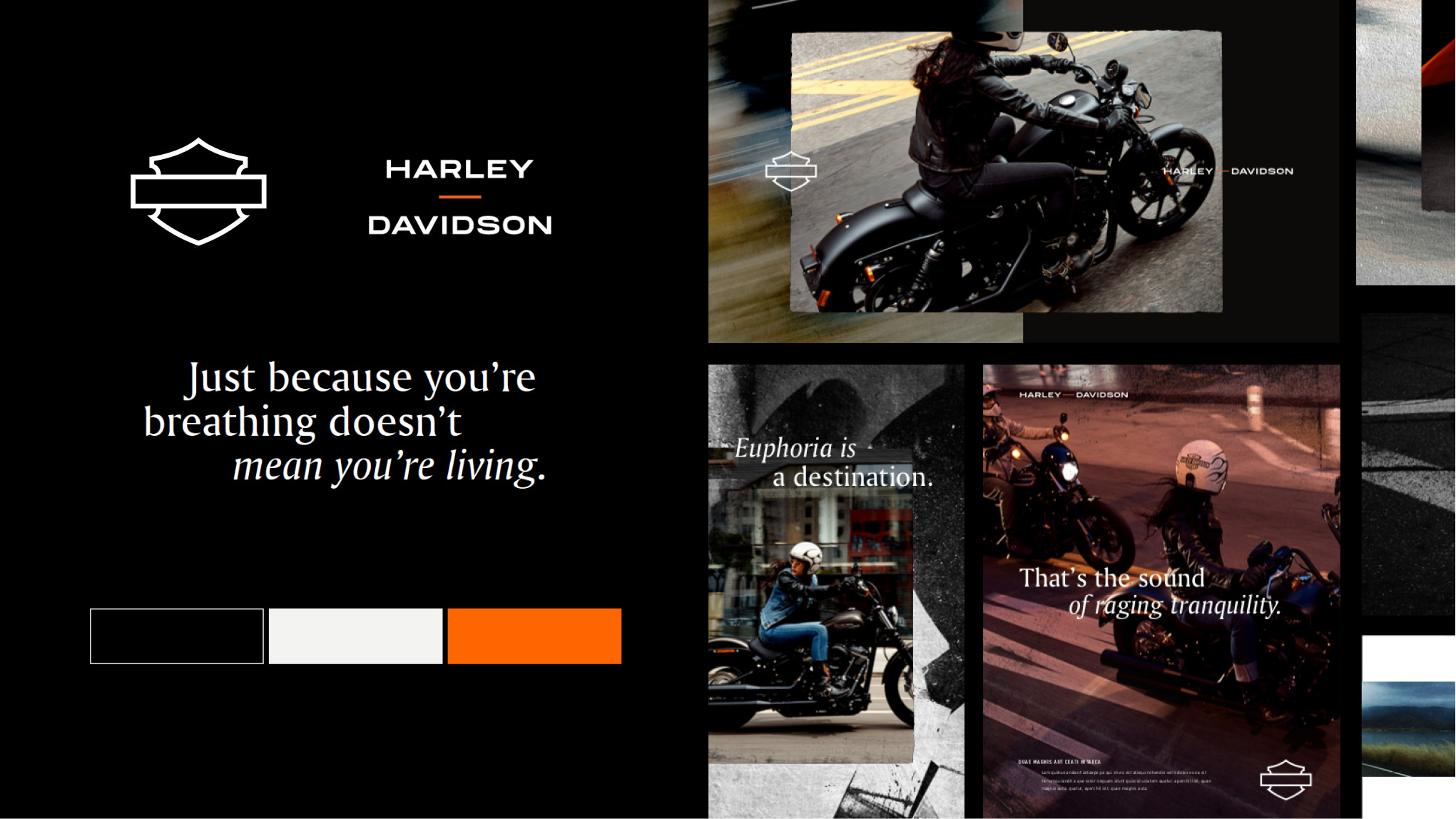
A fresh, bold and dramatic brand identity concoted by our brand team paved the way for us to breathe new life into the website. Defined by the principles of balance, horizon, and perspective, we leveraged and iterated upon the design system to ensure it remains faithful to the new brand vision.
COMPONENT
SYSTEM
Utilizing the new branding to create a modular design system that flexes across new and existing components, I helped define the translation of the new brand expression to the website and co-led the design endeavours for key pages such as the PDPs and PLPs and several high-visibility components while working closely with UX and development teams. In addition, I provided animation and prototyping support, exploring interactions and motion principles.
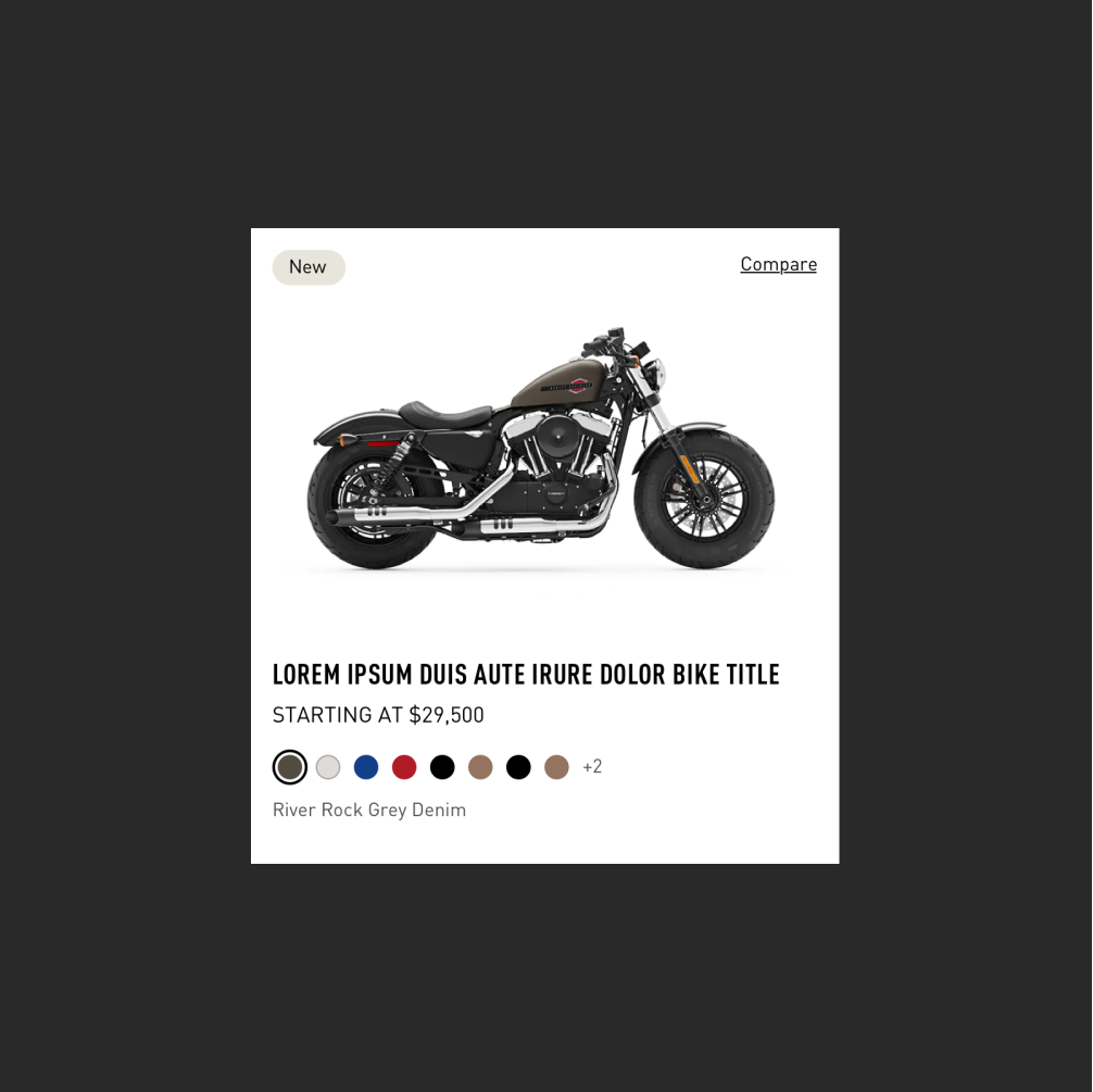
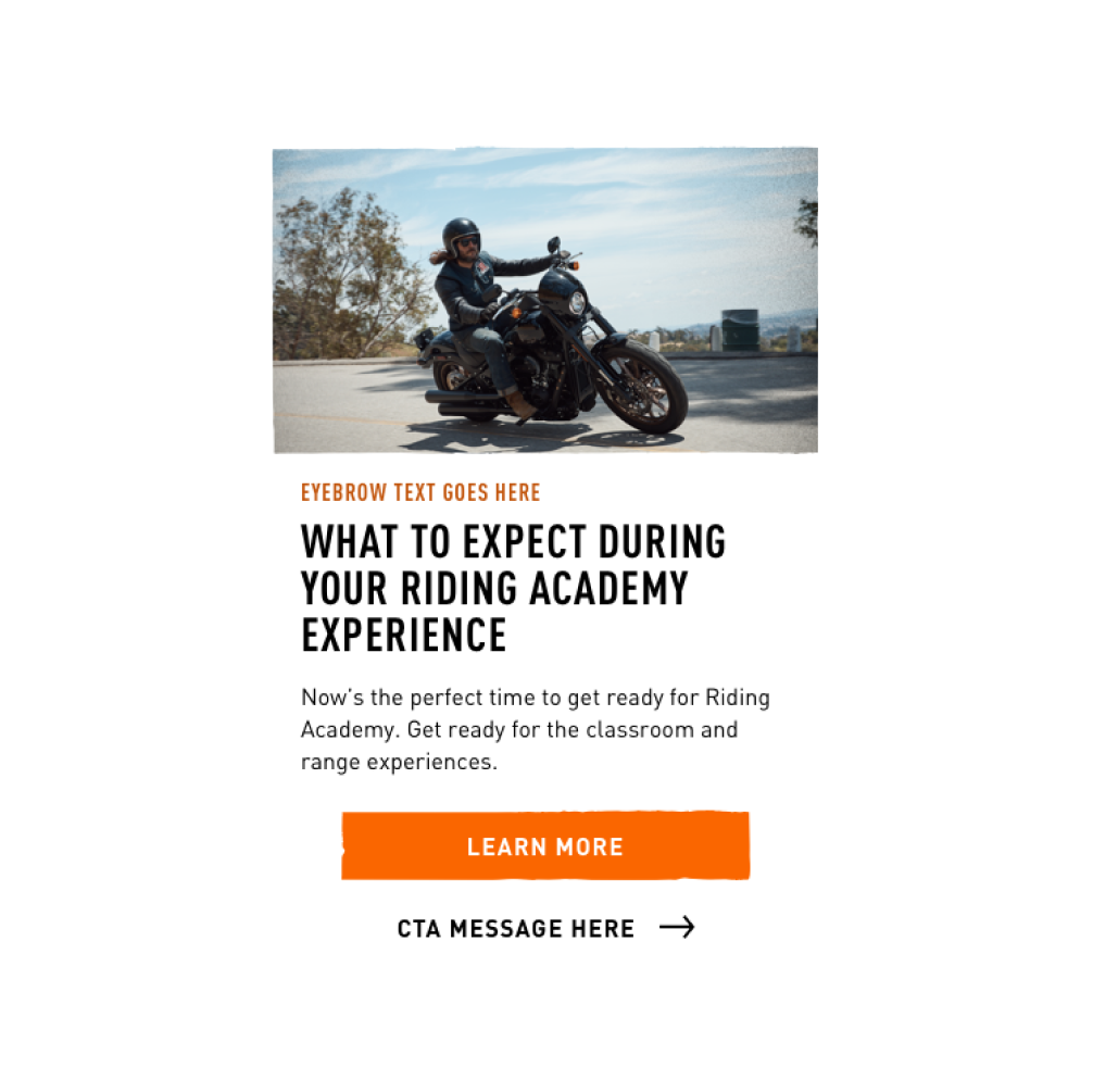
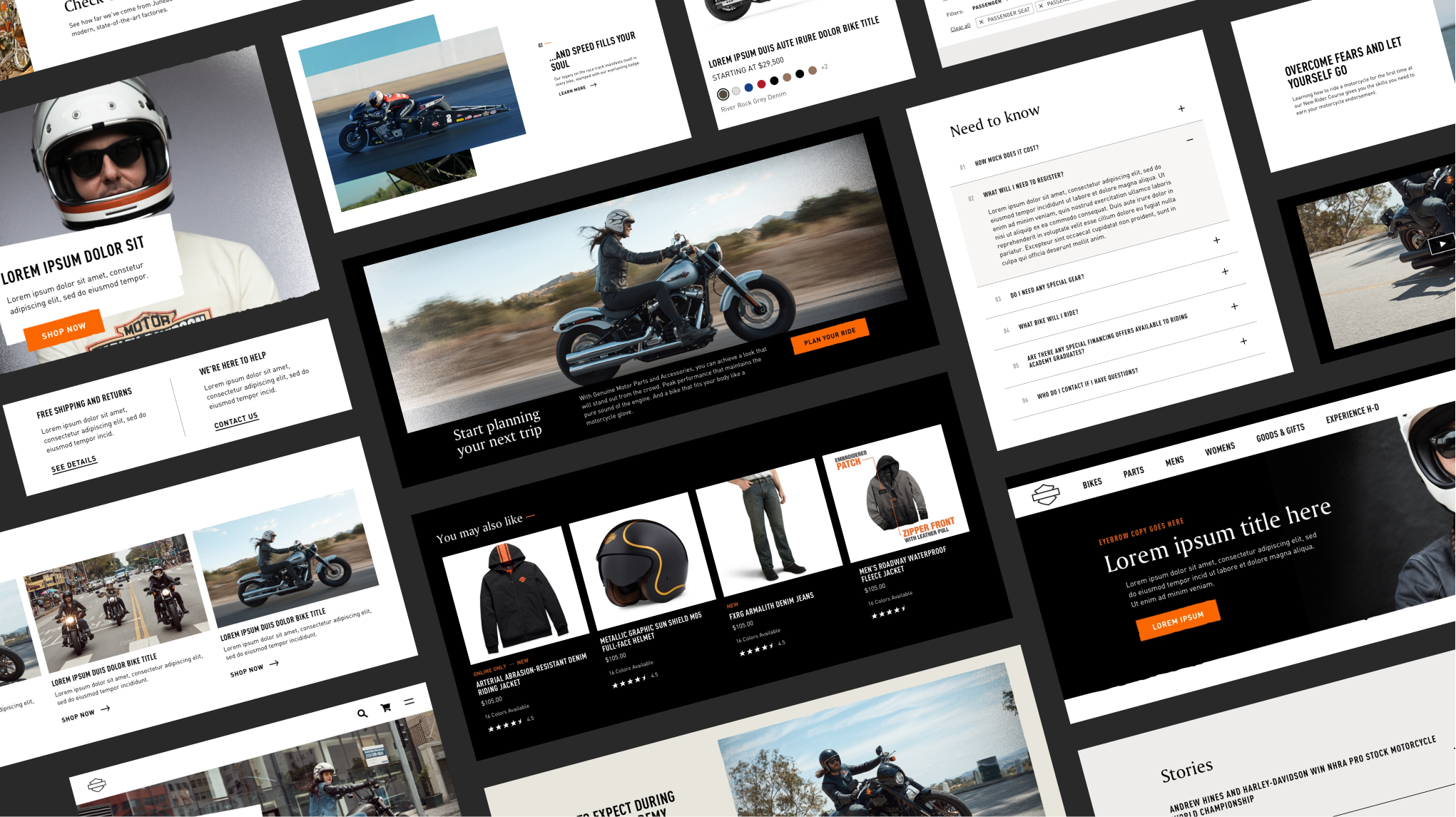
Component Variations
SITE EVOLUTION
The overall look and feel for the website shifted and evolved from its inception with some core elements retained throughout. Our initial approach was pristine, spatious and cinematic to reflect the brand system at the time. We eventually ended up with a direction that imbued the spirit of the first explorations but integrated grit and texture that felt more characteristic with the rugged and stout nature of Harley-Davidson.
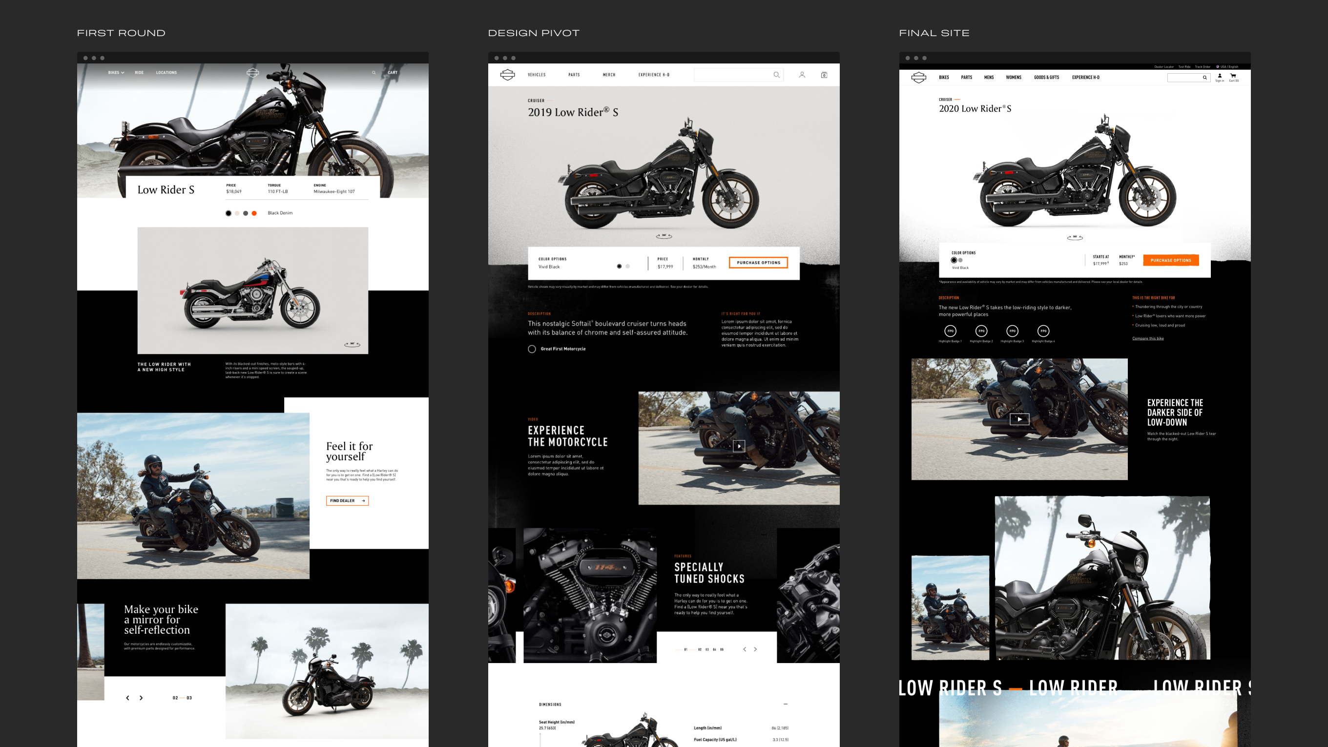
Website design progression.
MAIN CHALLENGES
FAMILIARIZING PROCESS
Harley-Davidson dotcom was the first time Droga5 did something of this scale and nature. The visual design and UX teams were figuring it out as we go, along with our colleagues from Accenture Interactive who formed the majority of the dev team.
PIVOTING DIRECTION
In addition to our initial set of challenges, a significant shift in the brand vision occured in the middle of the entire process, directing us to include more grit, texture and Harley-Davidson heritage motifs. We pivoted the entire design system, flipping every page and component to the new direction while meeting project milestones.
STRIKING BALANCE
The design system utilized many bespoke grit-based visual elements, such as ragged edges for image framing, background grain and weathering. We had to find a balance so the site imbues a distinct Harley presence without it feeling contrived or heavy-handed.
OPTIMIZING RESOURCES
The site was inherited from a previous agency. Before we began design work, we needed to establish what components we could salvage and reskin from the original site and minimize the amount of net new items to be made in order to save time and development resources. We needed to be judicious and crafty as we put pages together and be cognizant of our component budget.
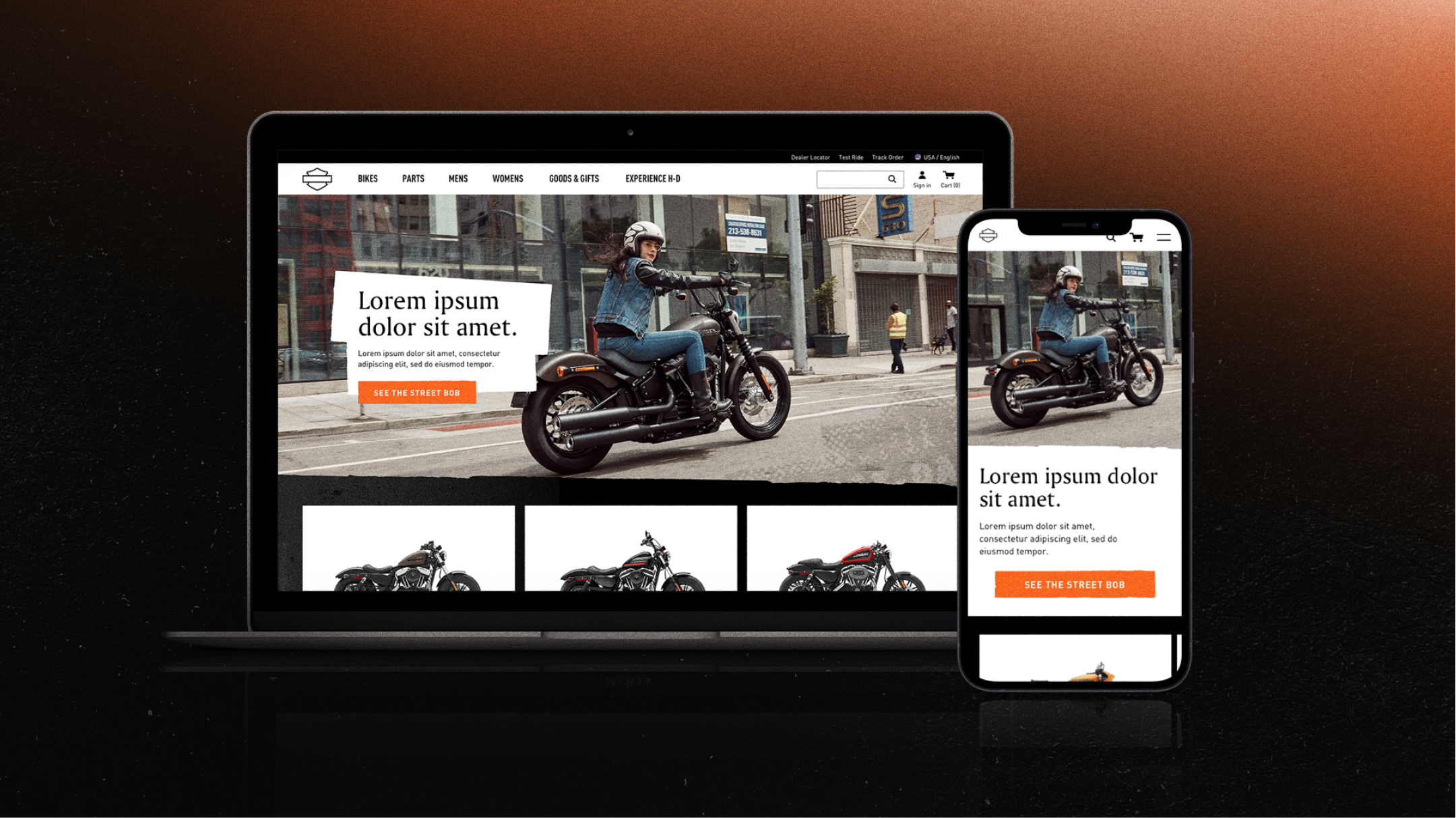
FINAL OUTCOME
9+ Design sprints and hundreds of component variations later, Harley-Davidson dot com was launched, in conjunction with the release of a brand new Vis ID. These are some of the screens I directly worked on that were ultimately delivered to developers.
PROJECT TAKEAWAYS
This website redesign was by far the largest digital undertaking by Droga5, and the first instance where we worked directly with Accenture Interactive after the agency’s acquisition. A year after the website launch, we've found an 56% increase in conversion rate, 74% increase in revenue per visit, 17% increase in on-site content engagement and 9% decrease in overall bounce rate.
CREDITS
LEADERSHIP
Jason Severs, Julia Albu, Tasha Cronin, Devin Croda, Anna Fine, Craig Wong
VISUAL DESIGN
Kayt Brylinsky, Albie Eloy, Winnie Tseng, Felipe Villareal, Michael Balsat, Matt Zazewski
BRAND TEAM
Rich Greco, Mark Yoon, Ali Lee
UX DESIGN
Jenny Clark, James Garvey, Flora Kwong, Xin An, Owen DiRienz, Jeremy Zerbe
DATA STRATEGY
Tradd Salvo, Christina Fieni
PRODUCTION
Colin Neff
ACCOUNT
Amy Longfellow
This opportunity was undoubtedly an important project for myself, the team and the agency. I was fortunate enough to be heavily involved in the visual design process—here is a more comprehensive look at the evolution of the site from kick-off to the final delivery.
Also Check Out
IHOPBranding
J.P. MorganBranding
