J.P. MORGAN
DURATION
JUNE 2020– JULY 2020
ASK
BRANDING
WEB DESIGN
ROLE
SENIOR DESIGNER
AGENCY
DROGA5
J.P. Morgan approached us to create a brand identity for an entirely new line of business within their portfolio called Wealth Management that reflects a younger, affluent audience. Infusing freshness and excitement from the Chase brand without overriding the vital trust and stability of J.P. Morgan.
We defined core brand elements and created a playbook to bring them to life in proof-of-concept applications that included digital executions for a Q3 2020 launch, working in parallel with a separate team designing for the masterbrand.
My role throughout this project was to work closely with the Design Director and Junior Designer to explore and fully flesh out the design system. Providing support for all digital executions and motion.
AUDIENCE
OF FOCUS
Before jumping straight into our explorations, the first crucial part of our strategic framework was defining the audience of focus. We have identified certain key qualities and principles valued by these individuals:
Simplicity
Ambition
Humility
Meaningfulness

To them, they are eager to grow their wealth as a means for better experiences and life outcomes and are opposed to displaying and overtly flaunting their wealth.
KEY
CONSIDERATIONS
Establish Wealth Partners as the industry leader that outshines the current Wealth Management competition.
Be more accessible and open to a newer wealth audience by brining in brand and tonal cues from Chase, primarily through photography.
Demonstrate how Wealth Partners enables people to live a more impactful and meaningful life through simplicity.
Feel distinctive yet undeniably an extension of the J.P. Morgan masterbrand, which was being explored in a parallel workstream siumltaneously.
MASTERBRAND
BRANDING
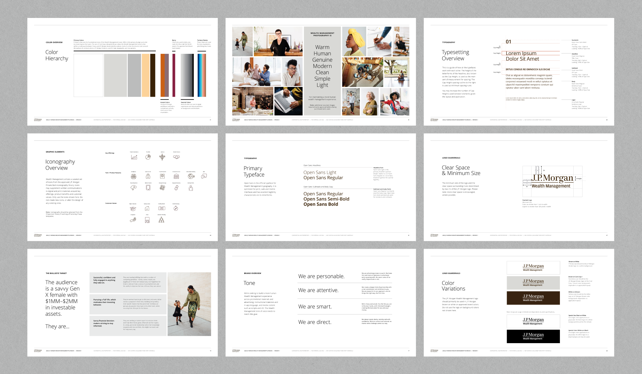
As a starting point, we based our design system from these explorations started earlier in the year by our J.P. Morgan Masterbrand team. In particularly the relationships between elements such as the use of horizontal divider lines and field of color.
Brand expression samples from the JPM Masterbrand team
MAIN CHALLENGES
UNIFYING PERSPECTIVES
With a sizeable and established institution like J.P. Morgan Chase, a multitude of client stakeholders were involved throughout the entire process of the brand development from c-suite management to marketing personnel. Alignment during each stage of the project was crucial, and we made sure our intentions with each iteration was apparent and clear.
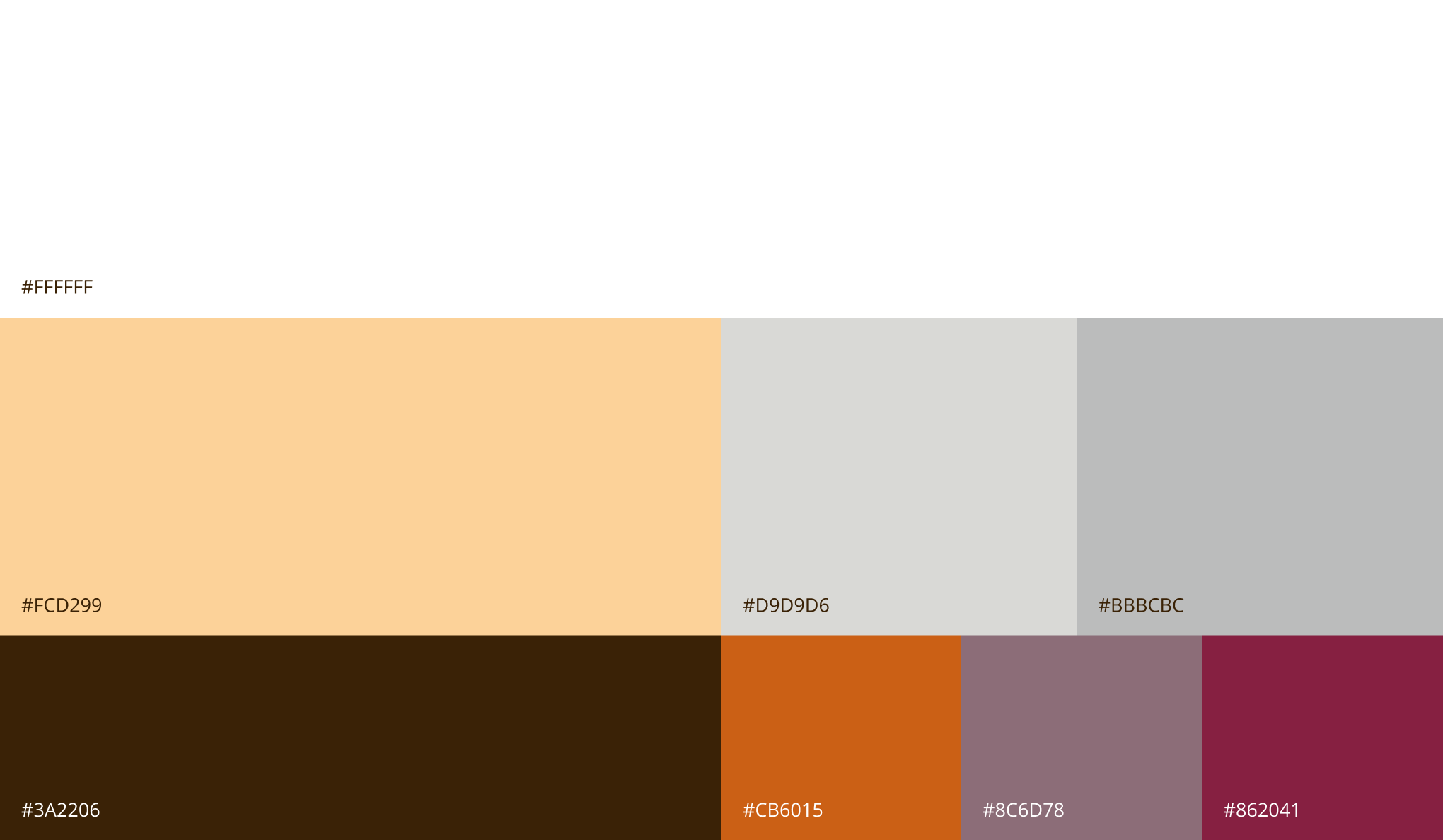
REFINING COLOR
Out of all of the pieces of the branding, landing on a color scheme proved to be the most challenging. While attempting to invoke youthfulness and freshness, we considered ADA complicance, variety of colors for data visualizations and bespoke usage for each tier of wealth management services.
SYSTEM SCALABILITY
While we desired a beautiful design system, we took into consideration that the rules and guidelines we define must scale for use throughout an organization as large as J.P. Morgan, by personnel who are ultimately not designers.
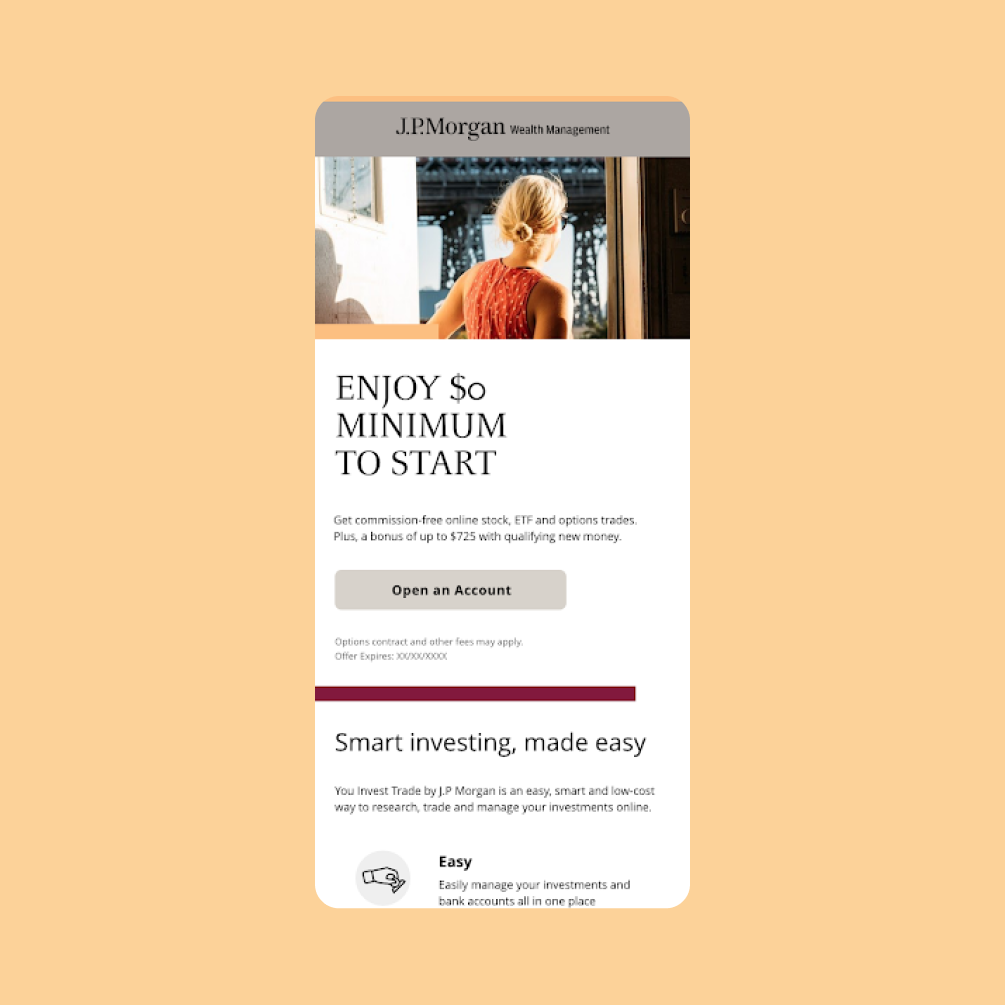
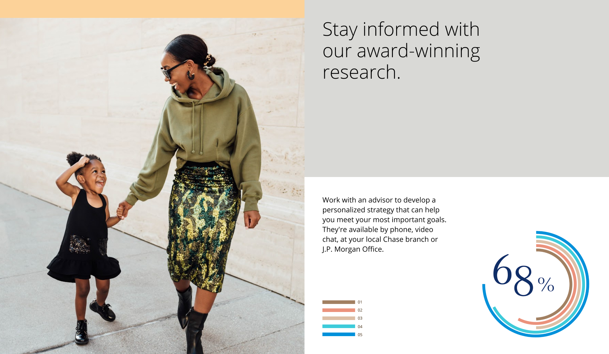
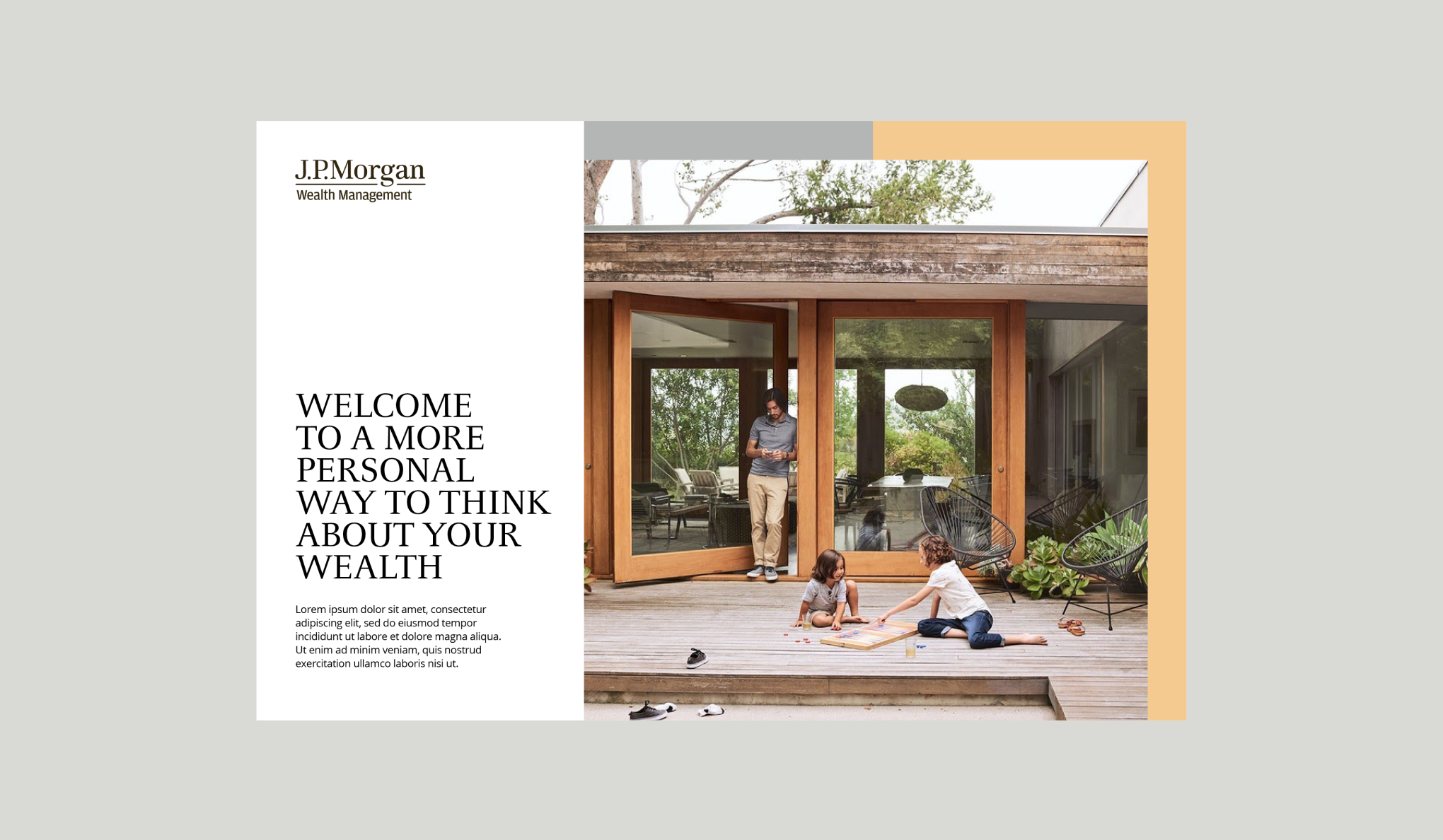
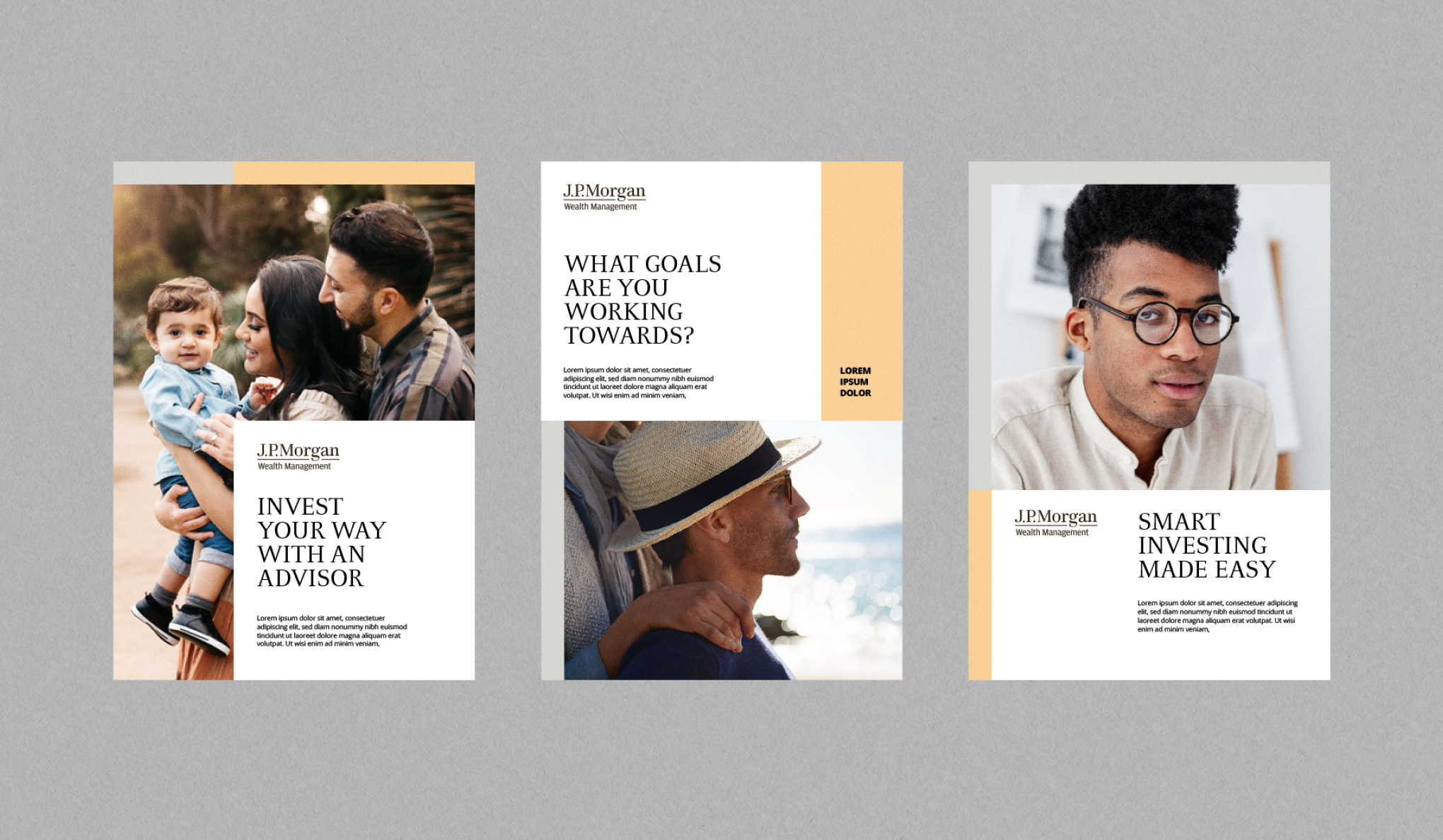
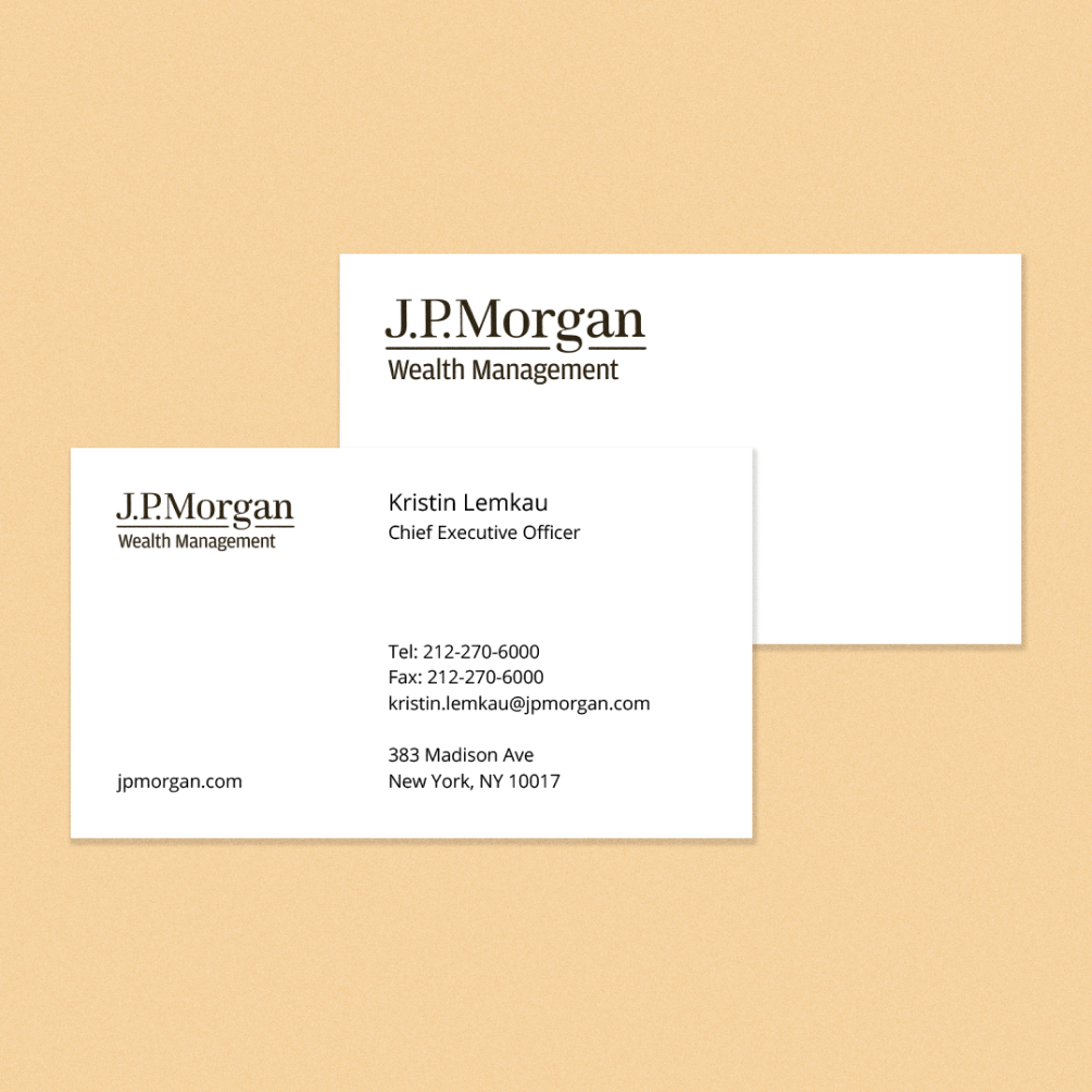
FINAL OUTCOME
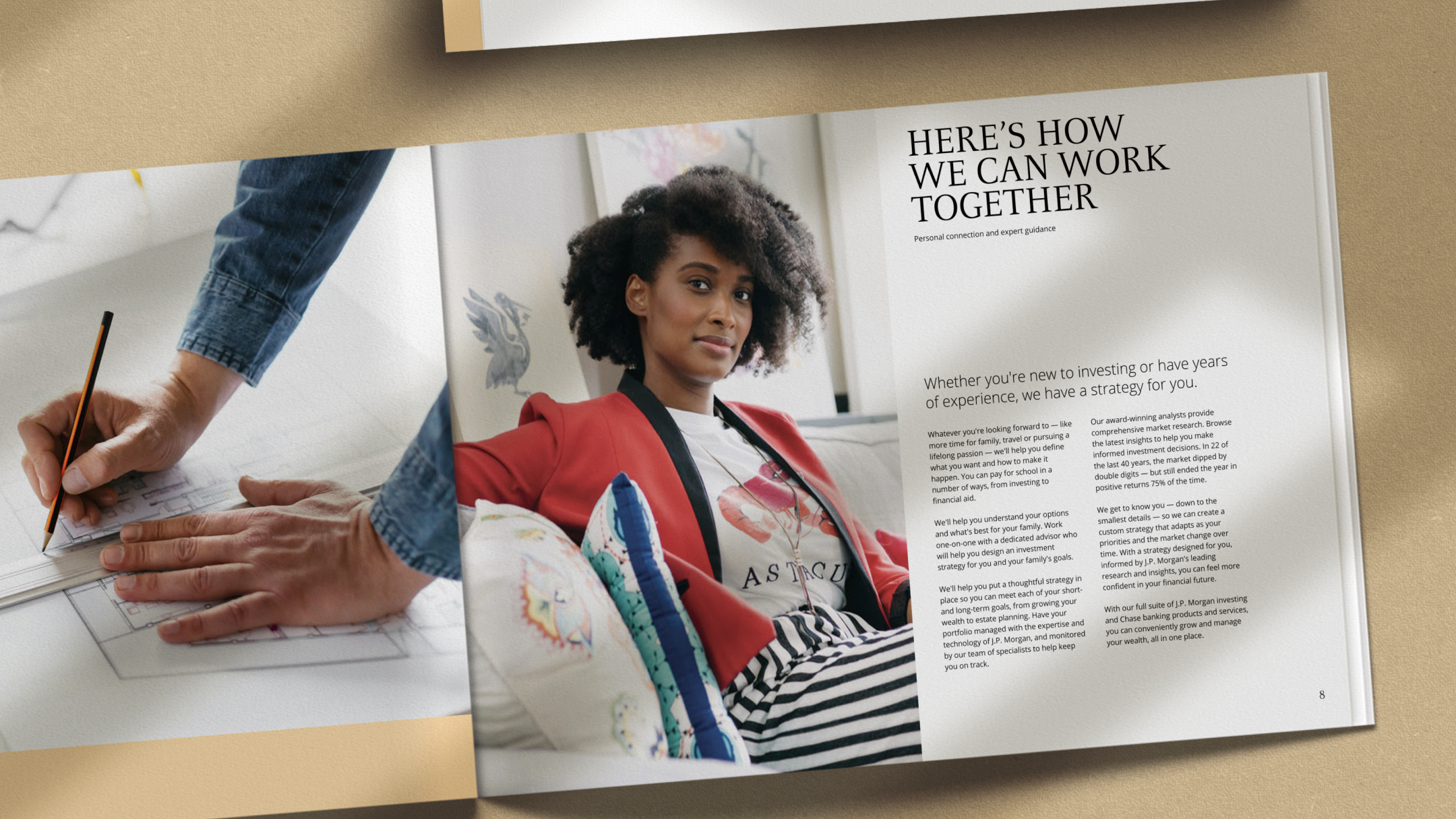
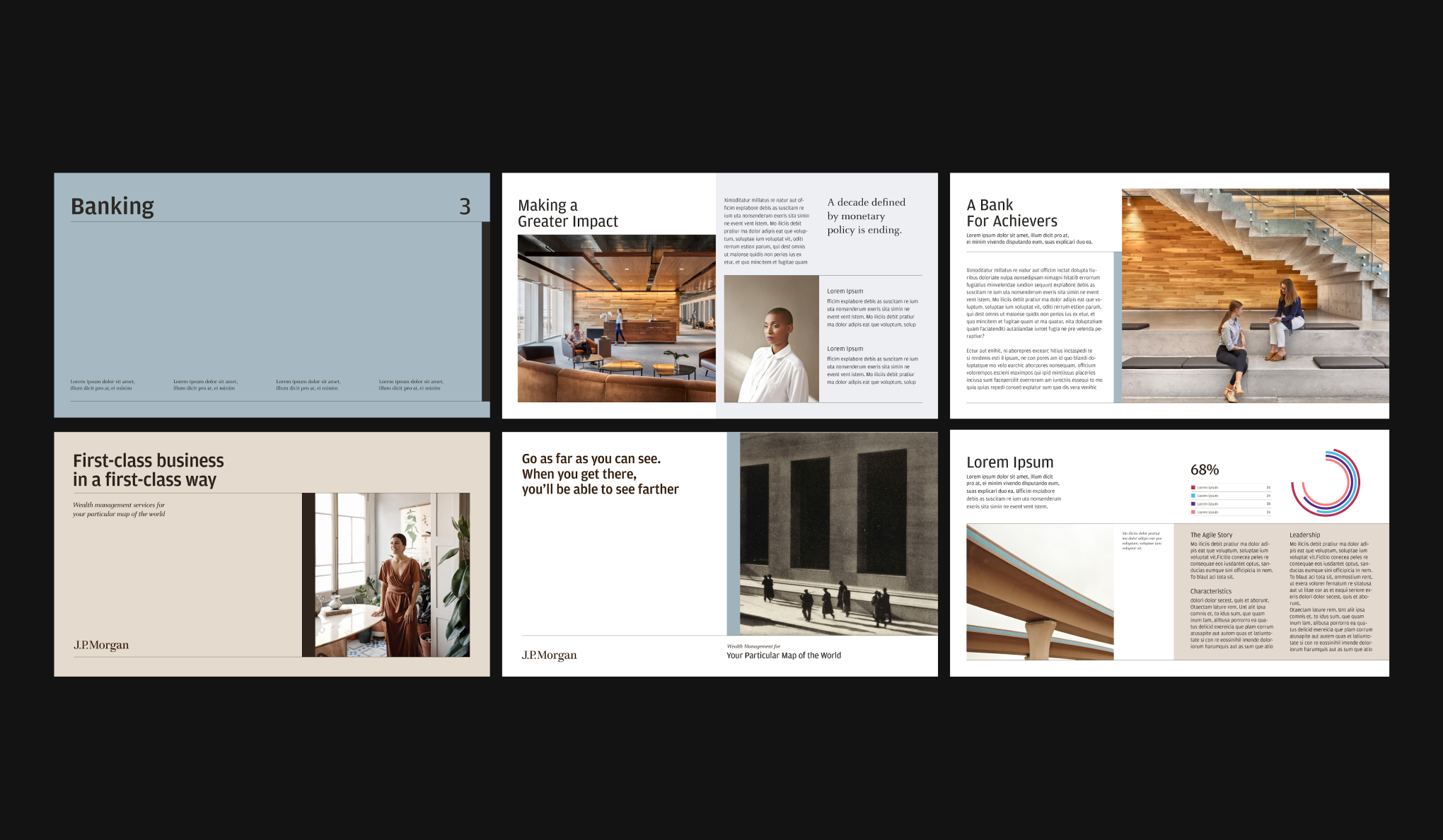
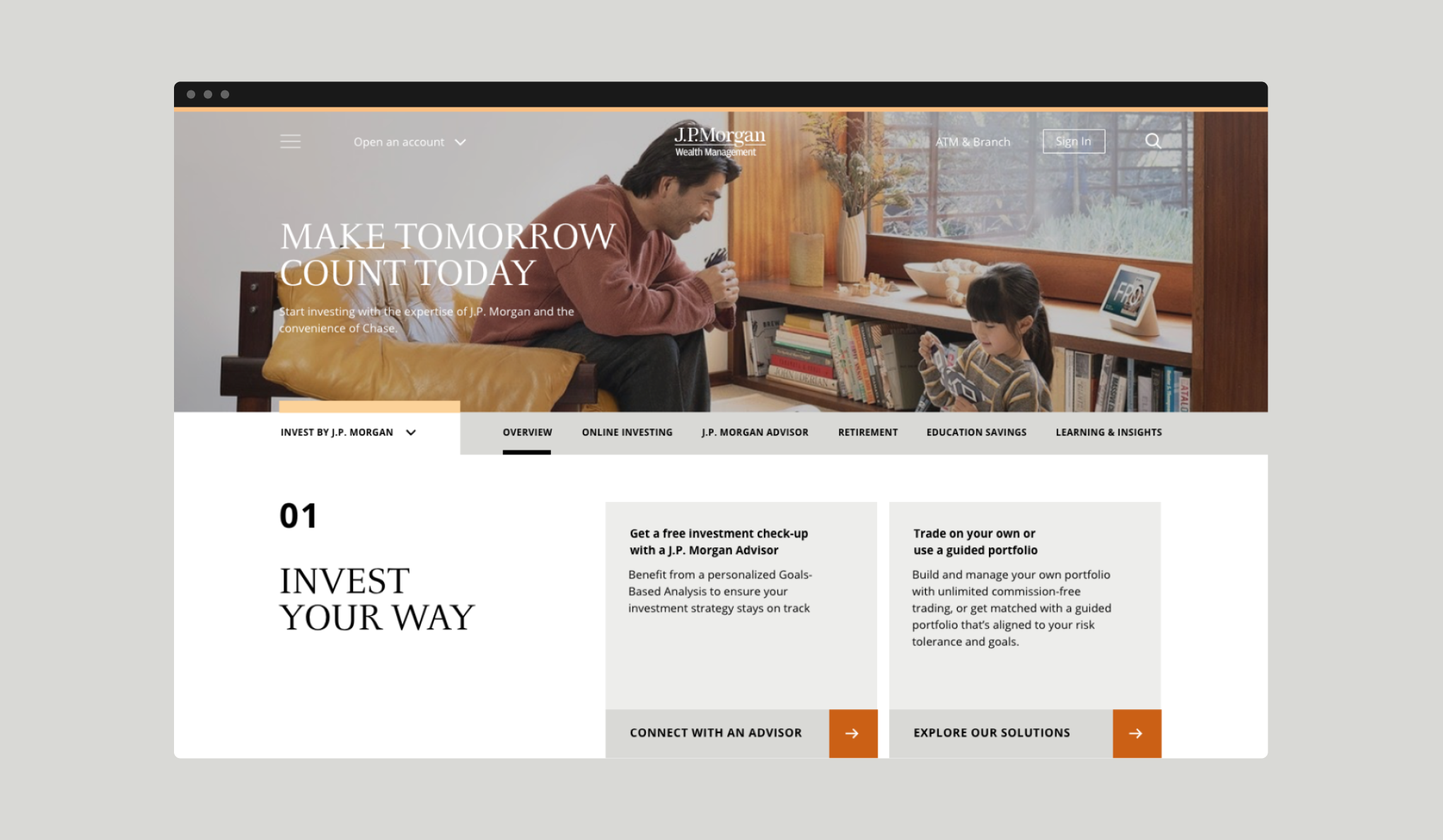
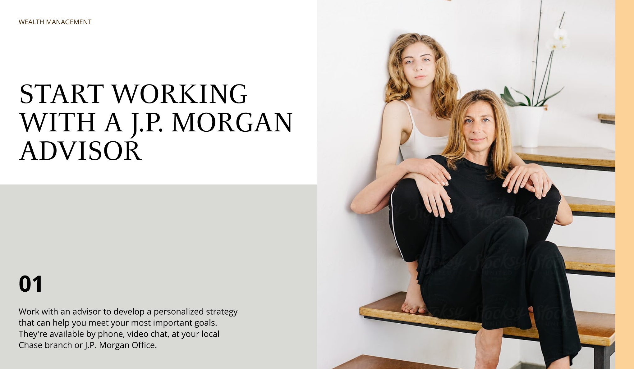
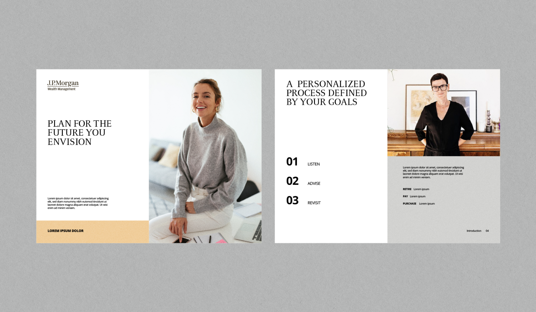
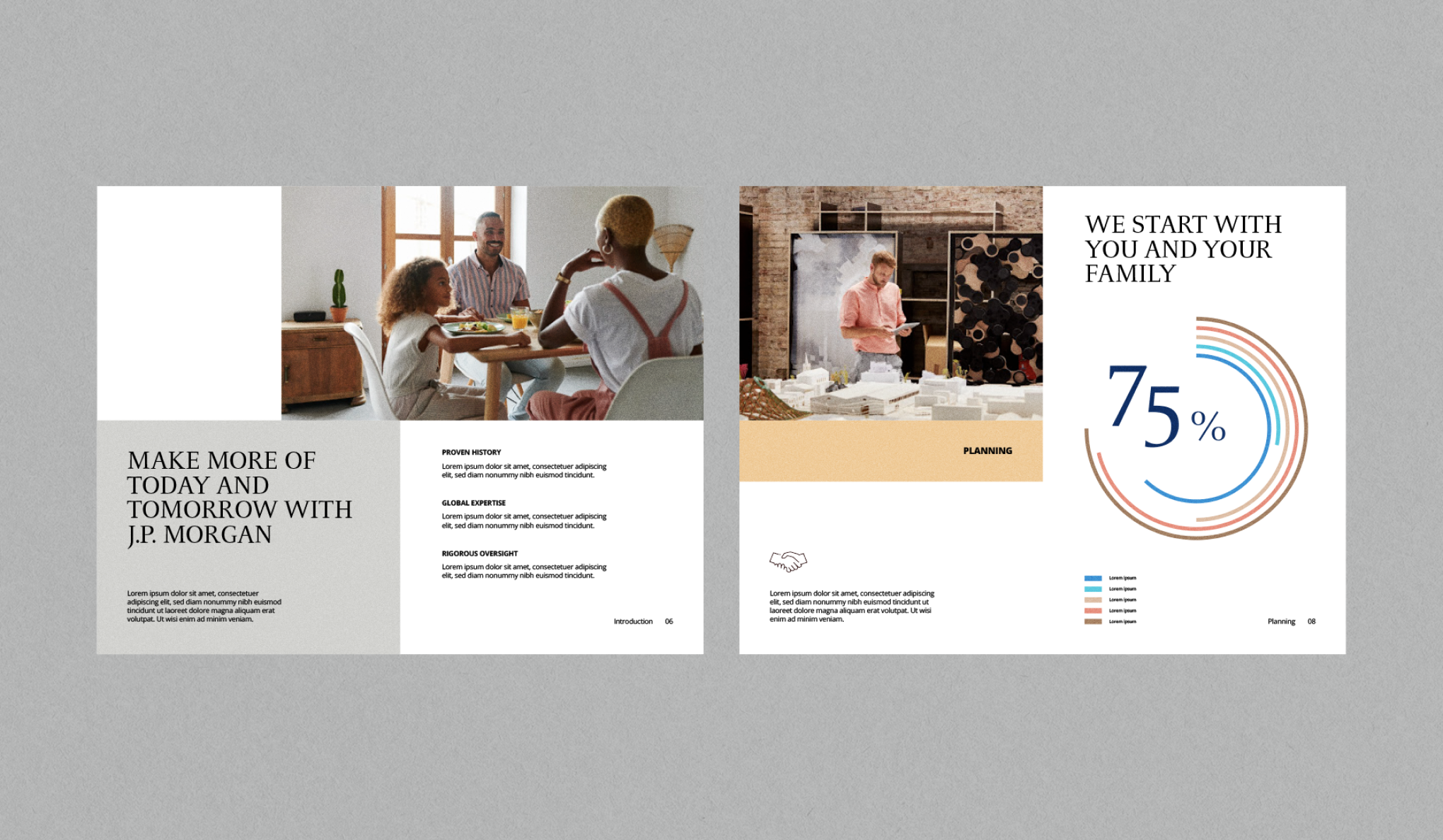
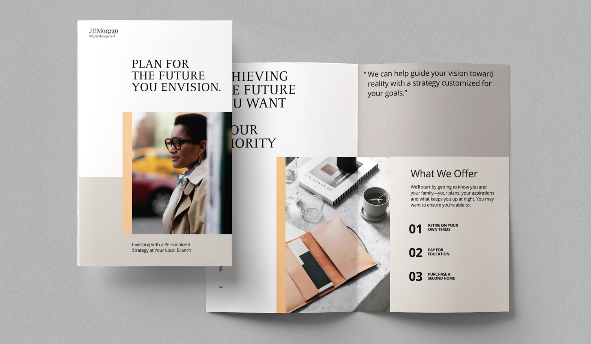
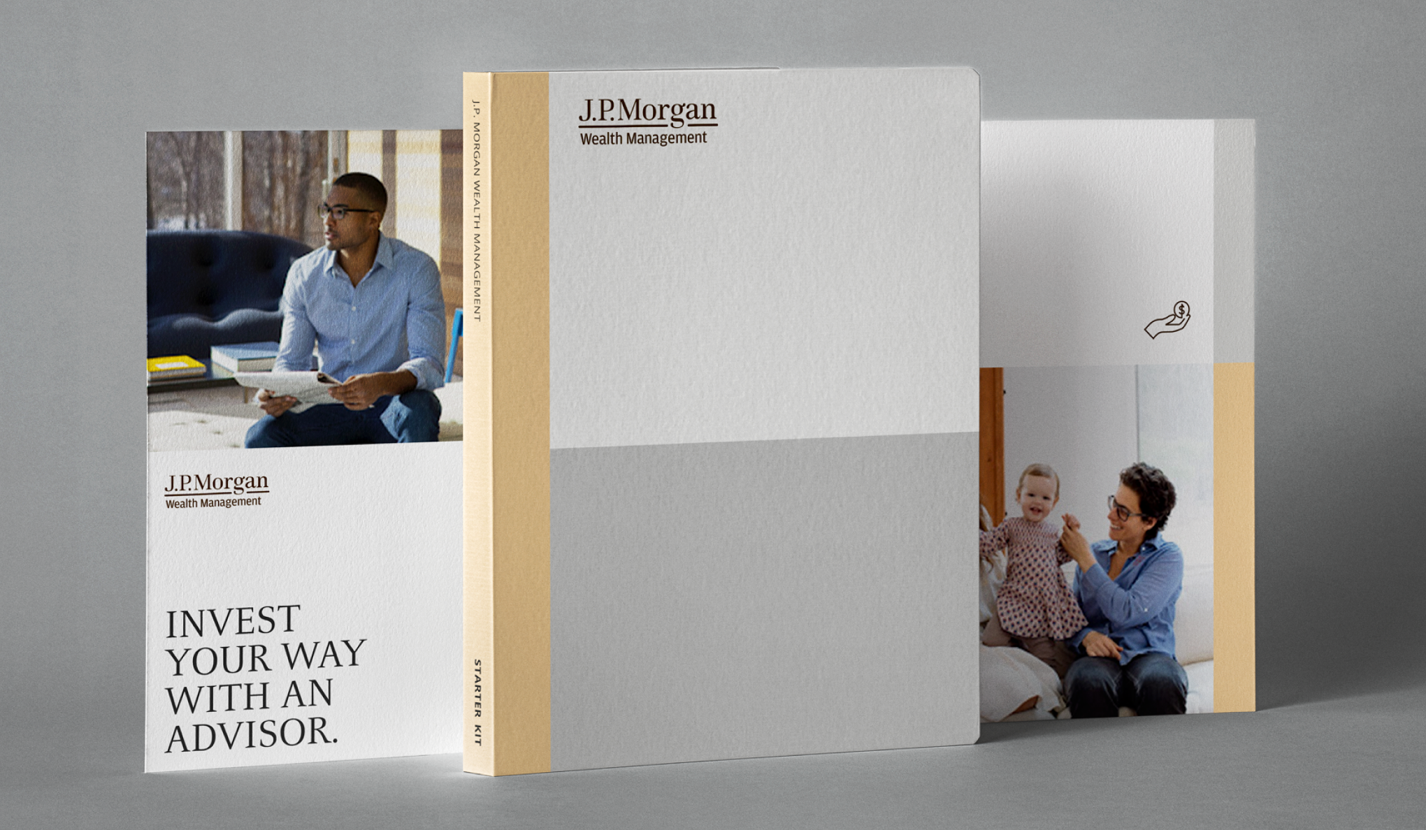
After client sign-off, we provided the design system to their internal teams to continue to evolve and execute. These are some applications that helped us express the extent of the design system and were ultimately used as testing stimuli.


CREDITS
LEADERSHIP
Jason Severs, Nate Scott, Mariana Gorn
VISUAL DESIGN
Albie Eloy, Lee Pozin
PROJECT MANAGEMENT
Chase Pinckney, Janelle Whitehurst
ACCOUNT
Greg Wesh, Sharon Byer, Kristen Avila
This branding project oversaw many iterations and changes throughout its cycle that were almost drastically different from each part. Overall, this was a fantastic exercise in exploration and design systems development.
Also Check Out

Harley-DavidsonWeb Design

IHOPBranding
